A problem I encountered with that tool is that the colour appears checkered. In the end I decided that pattern on the frog works well to make him stand out from the waves around him, and I have added little details to the waves too which help the whole image look good as a whole.
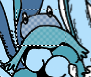
 After I had decided this, I just had to choose between a lighter or darker shade for the frog's head. The original character has a green head and a lighter stomach, but I couldn't achieve the right shade of the stomach so had to improvise. I tried two shades for the head, a lighter and darker (as shown on the left) and decided the darker looks best.
After applying these qualities to my piece, I think the overall image looks more detailed and full of life, which is how I want this design to look!

No comments:
Post a Comment