Since learning about what's expected of us in the biggest module of the course, I have been thinking about ideas for the past few months that will allow me to apply the skills I've learnt so far, as well as develop and learn new things. I decided I'd like to explore a different way of telling a story, expressing emotions using subtle elements of an animation, such as lighting, colour schemes, and music.
I was inspired to look at this angle by a few short films I have seen recently, such as Glen Keane's 'Duet' and Ryan Woodward's 'Thought of you', which is the sketchy, smoothly animated style I would like to try and replicate somehow. Initially I thought it would make the most sense to animate two dancers in a routine, but I could translate their movements into animals; It depends what kind of music I use and the choreography, but I thought it better to explore other options too.
After talking to my tutor about my ideas, she is willing to get me in contact with a dance school teacher she knows, who's students would like to work with an animator, so that I can work collaboratively with people who know how to dance and choreograph a piece. This combined with finding a musician who could compose a song for us, or finding a track we like, is really starting to bring this project together already.
Until then I will need to research into a broader range of animated dancing, such as from Norman McLaren, and experiment with a few ideas on how to tackle this brief until one particularly stands out.
Here's the Rationale that summarises my ideas so far:
Thursday, 3 December 2015
Saturday, 10 October 2015
OUAN603 - Extended Practice
The final major project of the year is Extended Practice; worth 60 credits, it will be crucial to keep on top of the workload to do well in this project.
Unfortunately I missed the briefing, however the information is available online to see. After reading through it, it's clear that we have the opportunity to produce pretty much whatever we want, as long as it's discussed with the tutors beforehand and as the project develops.
I have two months to write and submit the rationale, which will outline my idea(s) and allow me to get confirmation on how doable my project is.
The statement of intent is the next major stage of the project, which will be a finalised version of the rationale to confirm who I will be collaborating with and how my animation will play out.
After this there will be space for me to get on with researching for and developing my animation, this will be where I continue testing different aspects of the film so that I can have an informed decision when choosing my style etc.
Along side the practical work, I should be documenting my progress, as well as research, onto this blog so that I can reflect on my progress and evaluate my reasoning for all aspects of the film.
The set up of the module will give me the opportunity to work on a major project and hopefully produce a decent animation, I'm looking forward to it!
Friday, 15 May 2015
My Time With The Applied Animation Module...
After 4 months, we have come to the end of this project; It has been an interesting experience with a lot of highs and lows. The lows mainly being the stress that came towards the end to try and get the final piece finished, which unfortunately took its toll on us all eventually.
It was good to be able to see how 2D and stop motion would merge, and a lot easier for me not to have to animate the faces as well as the bodies. I think because of the use of both mediums, we can use the animatic as a way to explain the performance without completely finishing the animation (since David's animatic has enough movement in it so it isn't boring), so the film still makes sense either way. This took some pressure off us to realise this, but it is still a shame we couldn't completely finish the sequence in the time period we have.
Apart from this I think we have all done well; having the stop motion and 2D animation in production at the same time made it easier to get more of the film done. I'm glad that the faces sit well on the characters - though they are very exaggerated, this makes the animation more interesting to watch.
I think at times towards the end of the project the communication wasn't that good; particularly whilst putting together the title sequence and credits since the fonts don't match, but overall we still managed to do well.
I was initially excited to carry out my first idea with the process of how supermarket's import meat, but ultimately I wanted to improve my skills as an animator so thought it better to focus on that instead. This is why I'm glad I dropped my first project - the classmates whom I had initially asked to help me with it didn't have much time to lend me a hand, so I would have had even more to do on my own.
Despite this I still didn't manage to finish the stop motion sequence for the music video; I did have a plan of action but fell ill in the last week so couldn't get as much done as I would have liked, which I am gutted about. However I still think the final piece looks good and is enjoyable to watch.
The parts that I have done for this final piece (as illustrated in my blog) are: the stop motion parts and the text in the introduction.
The Stop Motion
It's safe to say the part of the process I have enjoyed the most is animating the stop motion. This was my biggest assigned role from the start, and the part I wanted to experiment with and develop further.
In the end we managed to get 1 minutes worth of footage, which is about half of the full animation. The video below is an unedited version of the animation, David has edited this and looped parts of it to make it last longer, which works a lot better then the order I've put it in here.
Overall, I am happy with the animation I was able to produce; the main problem with it however - that a few people have pointed out - is the lighting. We used the florescent lights which constantly switch on and off about 50 times a second, normally used just to set up the stop motion pieces to then be switched off while animating. Apparently there are ways to fix this by either editing the photos or putting some sort of filter on so that the lighting looks to be on purpose, which we can always look into after the deadline.
Considering how stiff the models are, I feel that I have managed to move them fairly well; the characters were as I predicted earlier, stiff but manageable to manoeuvre. I think they were starting to take the strain towards the end, particularly the strawberry since she is the one who had to move the most; the drummer's arms or seating position weren't very stable but he could stretch further than the others; the lemon was hard to move but I only had to move his arms so I didn't have much trouble with him; the aubergine was the wrong proportion compared to his saxophone and couldn't move far so there were some issues there; and the orange's arms had a limited range but I think his motion works really well for this animation.
The animation is jagged in places but I can see as the sequence plays out, my animating improved. This in itself is an achievement for me, since my aim in every project is to improve my skills as an animator!

Thursday, 14 May 2015
Editing the Title Sequence...
After receiving feedback from David and Grace, we decided that changing the font would look better. After looking through the fonts available on Premiere again, I tested out a few over one of the characters (highlighting the word 'Manny'):
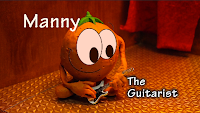

I am happy with the final font I chose; I think it looks a lot more professional then my previous choice, yet still quite bold. Despite this choice the white font doesn't stand out on the floor, which is only an issue with this character's shot, but it is still readable.
Another piece of feedback I got was that the text should be changed on the front of the curtain from "Introducing..." to "LCA Presents" or "Eating Healthy with Hi-Vit" (the film title) or something along those lines. My main issue with using the suggested line is that it isn't the Leeds College of Art who is presenting it, but rather the three of us who worked on it; and people might not understand the abbreviation of "LCA", especially children at whom this animation is aimed at.
Despite 'presents' sounding more professional than 'introducing', we would have to come up with a group name or simple way to introduce the show without leaving too much text to read. Using the song title could be a good idea but it will ruin the surprise of the band being behind the curtains. Either way I tried a few variations of text to go on the curtains:
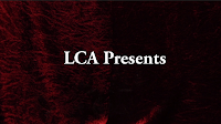

Ultimately I still feel that using "Introducing" makes the most sense for this film, because it's introducing the stage with the band name on the back wall, as well as the characters, and my teammates reasoning for the other phrases are unexplained.
 |
| Fonts on Premiere |


 |
| The Final Font |
Another piece of feedback I got was that the text should be changed on the front of the curtain from "Introducing..." to "LCA Presents" or "Eating Healthy with Hi-Vit" (the film title) or something along those lines. My main issue with using the suggested line is that it isn't the Leeds College of Art who is presenting it, but rather the three of us who worked on it; and people might not understand the abbreviation of "LCA", especially children at whom this animation is aimed at.
Despite 'presents' sounding more professional than 'introducing', we would have to come up with a group name or simple way to introduce the show without leaving too much text to read. Using the song title could be a good idea but it will ruin the surprise of the band being behind the curtains. Either way I tried a few variations of text to go on the curtains:


Ultimately I still feel that using "Introducing" makes the most sense for this film, because it's introducing the stage with the band name on the back wall, as well as the characters, and my teammates reasoning for the other phrases are unexplained.
Wednesday, 13 May 2015
RSA Animates... Documentary
This is a documentary style animation; since it's not necessarily factual but rather stating theories, but it's still portraying information in a time-lapse style. The hand drawing the images and text is keeping up with the narration, so the audience clearly knows what is being said and can see what the explanations mean with small diagrams.
In this particular animation, the narrator seems to waffle on about the theory of motivation, which is interesting to listen to but it runs for a bit too long. This way of portraying theories is the type of thing that is meant to make the audience think about what they have listened to more to build up their own theories on the subject; it would be a very good way to portray factual information as well since the pixilated hand could draw clear diagrams, charts and percentages in this efficient manner, whether it'd be interesting enough to watch or not is another matter.
In this particular animation, the narrator seems to waffle on about the theory of motivation, which is interesting to listen to but it runs for a bit too long. This way of portraying theories is the type of thing that is meant to make the audience think about what they have listened to more to build up their own theories on the subject; it would be a very good way to portray factual information as well since the pixilated hand could draw clear diagrams, charts and percentages in this efficient manner, whether it'd be interesting enough to watch or not is another matter.
60 Second Adventures in Economics
I found a series of short animations describing economics in an interesting way; these animations are narrated by David Mitchell, who explains a few dilemas the government have with taxing or where and when to spend money. It's an advertisement for the Open University to encourage people to study economics, so there has to be an entertainment factor to these short films.
The animation is stylised and simple black lines on cream background, so it doesn't take too much attention away from the narration, but assists in explaining what is being said. I think this is the right balance of imagery and information, because it's still entertaining despite it not being beautifully rendered or with realistic designs. The information is portrayed quite fast which could be hard to keep up with, but the animation does make it easier to understand; I think animation is the best way to portray information quickly, compared to a live action sequence for example, since I don't think a live action film would be able to flow so quickly.
The animation is stylised and simple black lines on cream background, so it doesn't take too much attention away from the narration, but assists in explaining what is being said. I think this is the right balance of imagery and information, because it's still entertaining despite it not being beautifully rendered or with realistic designs. The information is portrayed quite fast which could be hard to keep up with, but the animation does make it easier to understand; I think animation is the best way to portray information quickly, compared to a live action sequence for example, since I don't think a live action film would be able to flow so quickly.
Marketing
As part of the pre production phase, Grace took on the job of making the DVD case and poster:
Overall I think they both look good and suit the same style; I particularly like the poster because of its vibrant colours and simple shapes. the DVD case is a nice colour but I'm not sure if it will appeal to our target audience, children aged roughly 10, purely because the colours in the background look a little bland, but at the same time this makes the characters stand out.
 |
| DVD Case |
 |
| Poster |
Monday, 11 May 2015
The Intro...
Unfortunately due to illness I haven't been able to do too much work over the weekend. However in order to ease myself back into animating, I thought I would get the title sequence done.
Initially I did the stop motion animation on this sequence, then sent it to David so that he could put the facial expressions on the characters, this is the combination of the two:
He purposefully left still images on each character as a gap to fit the name and occupation on; this turned out to be a good idea since it made it easier to cut the text in and out of the shot appropriately.
I decided completing this in Adobe Premiere would be the best way to develop my skills since I haven't used this software much and I can put into practice what my tutor taught the class about putting together a title sequence.
After importing the sequence above, all I had to do was create new title layers and put each character's name into position. There are a number of fonts available for all users, but I chose 'TektonPro White 34', because it has a soft black outline which makes the text stand out and suit the image well.
Since each character we recorded is in the centre of the shot, it was difficult to determine where the text should go, because putting it all to one side close together made the text-less side look quite empty.
I am happy with the final shot since the text doesn't take too much away from the rest of the image, but still portrays the information and is evenly spread across the shot.
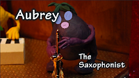 I tried to use the same font size and similar layout for each character's introduction, the only other two I had to play around with more were 'Aubrey' and 'Symphony'. At first with Aubrey I kept the text in the same position as with the orange; however the text covers up part of the face which I don't think works very well.
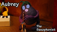 It would have looked better if the text was closer to the edges but this would take it out of the 'text safe' zone of the frame, so I compromised with the positioning. However I still feel that the final shot works well, despite it looking slightly different from the others.
Since there isn't enough space in the intro for a still shot of the strawberry, I decided to put some text on at the very end as she starts singing. Initially I wanted to put the text right next to her, like I did with the other characters, but something still didn't look right. If I had kept it where she was originally I would have had to keep the text smaller than on the other frames, so after trying some variations I thought the text in the top left corner looks better, since it's not overlapping any of the characters and it still makes sense as to who it's describing.
Initially I did the stop motion animation on this sequence, then sent it to David so that he could put the facial expressions on the characters, this is the combination of the two:
He purposefully left still images on each character as a gap to fit the name and occupation on; this turned out to be a good idea since it made it easier to cut the text in and out of the shot appropriately.
I decided completing this in Adobe Premiere would be the best way to develop my skills since I haven't used this software much and I can put into practice what my tutor taught the class about putting together a title sequence.
 |
| The editing box |
Since each character we recorded is in the centre of the shot, it was difficult to determine where the text should go, because putting it all to one side close together made the text-less side look quite empty.
 |
| An example of the text on one side |
 |
| The final shot |
 I tried to use the same font size and similar layout for each character's introduction, the only other two I had to play around with more were 'Aubrey' and 'Symphony'. At first with Aubrey I kept the text in the same position as with the orange; however the text covers up part of the face which I don't think works very well.
 It would have looked better if the text was closer to the edges but this would take it out of the 'text safe' zone of the frame, so I compromised with the positioning. However I still feel that the final shot works well, despite it looking slightly different from the others.
 |
| The final shot |
 |
| The final shot |
Once I had put all of the text in I exported it as a test to send to Grace and David for feedback:
I'm happy with the overall video; I included the "introducing..." text on the curtain as a way to introduce the band on stage (with the band name in the background) and the close ups of each character following, which I think works well because it's not too hard to read and builds up an atmosphere.
I showed it to a couple of classmates who were with me at the time I had finished this and they both said it works well, so hopefully more people agree!
Title Sequence Inspiration
Since I'll be putting text on the introduction, I thought I'd look at some other sequences from TV shows that incorporate text into their footage.
The Mad Men theme uses silhouettes with text flashing aside the images to introduce the programme. In my opinion though the font is easy to read, it flashes in and out of shot too quickly; this is understandable to get all of the information in but at the same time you can't tell what it's saying. However the way everything sits in the frame looks good and works well as a sequence; I've never watched the show but there could be a reason that the text moves so fast.
The TV show 'Game of Thrones' is a recently massive hit, just starting it's 5th season. Their opening credits are very well animated, giving off an eery atmosphere; The font used works well with the rest of the imagery.
The third video I picked is 'George of the Jungle'. It's a show aimed at children, so the colours used are basic and bright, with a fun theme song to go with it. Though there are moments where the contrasting colours flash at you (which are hard to watch) the use of text is good; it's mainly due to the way characters interact with it, such as pushing it aside as they swing. The font used has very straight lines and is covered with a thick, black outline, which suit the overall look of the cartoon style well.
Saturday, 9 May 2015
The Final Crit
Since I wasn't there to present the developed animation yesterday (due to illness) I left it to David and Grace to get feedback from it.
We took on board some of the feedback we received previously; in the last couple of clips I started to move the stalks on the character's heads for example, which make the drummer more lively. Watching this shows me how well the animation's coming on; it's a shame that we don't have a lot of the animation to show so far but I'm hoping we'll be able to get a lot done this week. The animatic flows well and the animation fits in nicely to the right places.
Overall the comments sounded good based on a discussion I had with Grace and David; the main points were about summarising the facts we include in the animation so that they are easy to read and understand within the 5 seconds we have left for it, which we will discuss as a group when we are all back in uni.
Suggestions of sound effects such as a crowd screaming and the drummer's sticks when they are hit together were made, which I agree with and think it would bring the animation to life and make it feel slightly more realistic.
Since the first couple of audio tracks we had didn't work as well with the upbeat theme of the song, we decided to ask one of our classmates if she would sing for our video instead. Rebecca Wong's version of the song sounds nice and in tune, but the timing is slightly off. There are ways we can fix this though, if we re arrange some of the clips or loop them then we can make it work.
The lighting is still a problem to most people, we'll either have to find a way to make it feasible to keep or edit it out (which could potentially take too long) but we'll see what we can do.
Wednesday, 29 April 2015
Animating Each Character...
After animating for a few days I've started getting to know the character models better. So far they have proved to be difficult to manoeuvre, since they are quite stiff and crack fairly easily; however I am managing to get some movement out of them, as I experimented with a couple of sequences:
I found that the aubergine is slightly wonky and the arms aren't quite long enough to reach the saxophone, but if I stick his feat to the ground then he should have enough stability to lean forwards and back, which could be a way to animate the saxophone solo later on in the video.
The orange also has one leg longer than the other, but he is more stable on his feet; despite this the only movement we really need from him is strumming the guitar, which at first I thought would prove to hinder us as his hands are a lot bigger then the guitar. However I think the motion we have for him works well and gives the piece a humorous charm.
The lemon doesn't have to move much either, though his legs are higher and even. The arms seem to move together unless I hold one of them still, which could become a nuisance to animate with; the basic movements he makes seem to be a bit slow paced compared to the upbeat song, but the animation still works fairly well considering his role in the music video.
In the end we used the character model that David made as a test for the pepper - since this one is much skinnier and accurate to the original character design compared to the one Grace and I originally made. This model doesn't have an armature, so based on my experience with animating plasticine previously in the module 'Responsive', eventually the plasticine will break; however so far it has been holding up fairly well and has been enjoyable to animate; it is easier to stretch and twist his arms, which is good for when he needs to hit the drums.
I can see that the strawberry will be the hardest one to animate; her armature is quite stiff and Grace had to use two different types of clay to cover her body, which means it won't blend well together so it will be harder to fix the cracks caused by her movement. She is the only character who moves around the stage, which will prove to be a challenge (especially with her legs); however I have managed to manoeuvre her as smoothly as I can, which gives the piece a quirky feel to it.
I look forward to seeing what they look like with faces!
Saturday, 25 April 2015
Change of Plans
Due to finishing off other modules, we have fallen behind schedule. Grace's original schedule stated that we start animating everything in the middle of April, but unfortunately I let other things get in the way of that.
However now that the work that was keeping us busy has been handed in, we can finally start animating on Monday! Grace has worked out that if we aim to take 300 pictures per day for 5 days a week then we can catch up and get the stop motion done in good time.
Hopefully if we keep to this new routine we can leave David enough time to animate over the top of it and put it all together into one piece.
Friday, 24 April 2015
Deciding on Roles
To organise ourselves, my collaborative partners and I decided upon roles during the post-production stage of the process; deciding this now allows us all to work together on a plan of action to make sure we finish everything in time for the deadline.
I will be doing the title sequence, which will be text on top of the curtains in the introduction. David will be creating the ending credits; if we have time me and Grace will animate the armature models to be included in these credits to add personality to their characters. Grace will be creating a poster to advertise our animation, which could potentially be translated onto a DVD case. We also found a first year student of our course who volunteered to sing the song; she overheard our conversation about finding someone to record the audio and seems happy to do it for us. This is a big help since we need to get this part done as soon as possible so that we can animate to it.
There are a lot more mini roles that need to be completed for the deadline as well, such as finding extra sound effects, but we will see who has the most time out of the three of us closer to the time to complete these tasks.
Setting up the Stage
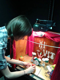
Before starting the animation, we had to set up the lighting, camera and files on the computer for Dragonframe to automatically save to. We have been keeping the stage in the specialist blacked out room specifically dedicated to stop motion animation, which Grace has been working on gradually over the past month. Moving the stage was easy because all of the wood is attached together, and it fits in the filming booth quite well; however the lights provided in each booth are attached as one mechanism so we were unable to use all of them to light our set.
However we were able to detach one of them to hang over the top of our stage, since we felt it should be brightly lit up with the impression of special effects being used - just like a real concert. Despite this, even with the lights Grace acquired to line the top and bottom of the stage and the LED combined, the image still wasn't bright enough. In the end we used the generic light that hangs above every station and what is used to light up most rooms in the university. We believe this creates a good atmosphere and creates good shadows as well as makes the characters visible.
We decided using my own Canon DSLR 1100D camera and tripod would be best, since I can bring them to the set in the classroom whenever I'm planning to go in and we can get started quicker rather than going at certain times to book out the equipment every day. My camera usually takes good quality photos and we can export the animation we make into image sequences with the right image size so that David can go over it with the drawn animation.
Now that everything is in place and we have a folder dedicated to this project on the university computer, we can start animating!
The Storyboards (Music Video)
David managed to get the storyboards done for us to start animating with! I think they're very well explained and use a good variety of green screening. A lot of the shots look quite similar, mainly at the same angle and focusing on the singer, but there are ways we can improvise with this. As David has already pointed out, some of the movements seem to be a bit too exaggerated to the point where I don't think the models we have would be able to perform some of these movements - but again he has said that we can change bits slightly if they don't work well as actions for stop motion.
Wednesday, 22 April 2015
My Collaborative Practice Pitchboards
These are my collaborative practice pitch boards, made by Cara Lambert with my feedback:
Evaluation
This module ultimately gave me a lot of opportunities to publish my work onto professional websites to win competitions, however due to the time limits on each competition on top of my course deadlines I did not feel confident enough to enter most of my pieces.
Despite this, I still had an enjoyable experience in making most of my work; I tried out different techniques and mediums that I do not get chance to practice otherwise. I wanted each piece to revolve around learning a new task, such as perspectives or colouring, which I managed to experience while completing this module.
The brief analysis and pitching tasks at the start of the year for our individual practice had a lot of potential to be useful in teaching me how to pick an appropriate brief for developing my practice. Though I did learn a few useful tips in how to present myself, I still did not understand exactly what work we had to present, so did not feel confident while in the pitching sessions, especially to people I do not know very well.
Even though I started late in my other competition briefs due to focusing on the pitch boards for the taught sessions, I still managed to map out a rough plan of when I should have completed each task. The area of practice I want to develop further for my career is animating, so a lot of the tasks took me a lot longer than I had anticipated, which means most of them are rough, unfinished pieces of work.
Having to create more than one animation for most of the briefs in order to make them substantial took its toll on the quality of my work, since I could not spend as much time on each piece - however I have produced a lot and there is potential with each animation to take further and include in my showreel, which was my ultimate goal through this module. I would have liked to have the animations finished in time for this deadline and entered into their original competitions, but I have learnt a lot about managing my time and which techniques work better.
The opportunity to collaborate came in the second half of the year; this was a new experience for me, and having the chance to work with my classmate proved to be an enjoyable task. Taking what we had learnt from completing the individual pitch boards, we chose the Propercorn brief and get creative with our final idea; the pitching of our idea a few weeks into the project did not go as well as we had hoped, with suggestions that we should change our idea. This ultimately took its toll on us, since we had six weeks all together to hand in for the deadline and we received this feedback too far into the process, we had to re-develop another idea in less time.
This meant that I did not have time to make a full 30 second animation; this is an ambitious amount of work anyway but even halving that time for the animation sample we ultimately decided to submit was only just manageable.
Doing this collaboration made me realise that it is harder to replicate someone else’s designs than I had originally thought; though the gnome design we had continued with was good and seemed fairly simple, I could not redraw it in more than one position. This limited the final animation slightly, since I had less time to make it anyway it would have been harder to try and move the character more than I did.
Apart from this, we worked well together and easily agreed on how each stage of the process was going; I can rely on her to get her parts of the work done, so it was easier for me to focus on my tasks.
In conclusion, I have learnt a lot about my area of practice by completing this module; even though my time was split between too many tasks, I have enjoyed using most of the techniques I have tried. It has made me realise that I can see potential for a career in any area of animation, which does not narrow down what I want to specialise in, but means I cannot rule out any possibilities which I would have done if I had not tried them in these tasks. The main area of improvement for myself is organising and managing my time better, if I had realised how long each project would take I would have given myself more time on each.
Tuesday, 21 April 2015
Qwertee - My Designs So Far
After posting both designs up a week ago, they are still up for voting. So far neither have been doing as well as my first two designs, they have both only been available in the 'New Designs (All)' section compared to the first two being in the 'selected' section of the voting pages.
As dynamic as the painted effect looks, maybe both designs were un original and a bit too messy compared to my inspirations. Saying this, I thought they might do slightly better with votes since they are both inspired by popular film/book series, particularly the Harry Potter logo since that is still celebrated by many today even though it finished years ago.
I think the first two designs did better because they are from a popular TV show and film respectively, and I created them in an original way with a variety of colours, which could have appealed to Qwertee users since the designs are so different from the usually popular ones.
Saying this, my most recent designs are still up for voting for at least another week, so they could do better by then.
 |
| My designs still on the website |
 |
| My designs that are finished voting |
Monday, 20 April 2015
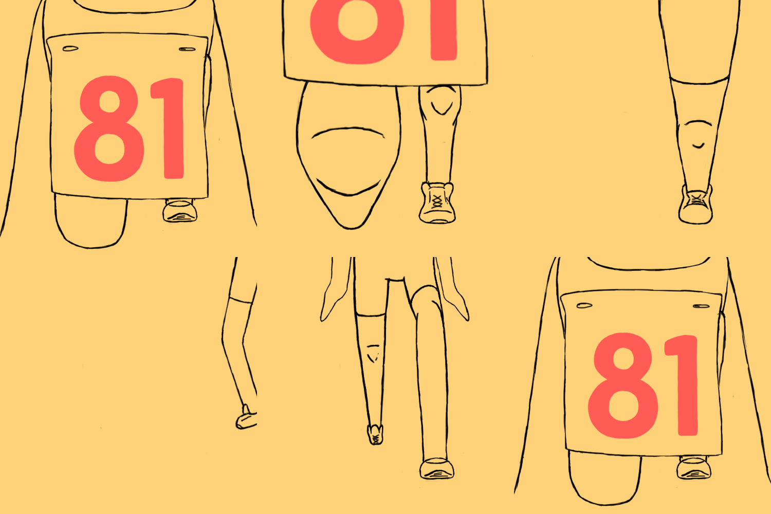
Bingomation - The Second Half of the Animation (81)
In order to get this animation to loop, for the second half of the piece I started animating backwards, so that it would be accurate. This technique worked for me since I was more confident with the positioning of the character each time.
Animating the character walking into the frame was also relatively simple; I can get away with them taking only one step and then turning on the spot, which moves fairly quickly anyway so I am happy with this part of the animation.
Seeing both elements together shows me how well it loops; I ended up making the first part faster as the character runs off, since this looks more natural then my previous test. The colours I have used so far make the shoes stand out, I'm not sure if I like what I have used so far, but the colour scheme is quite limited, so the skin colour will be difficult to get accurate, unless I change the colour of the background; despite this the authentic sketchiness and patches of colour could also work as a final piece. Apart from this, the physical animation looks good, I have learnt a lot about how perspective works and will incorporate this into my future works.
 |
| The final piece |
Since I have until the 11th May to complete this, I would like to spend more time establishing the colours and double checking the perspective is right based on feedback when I show my classmates.
Friday, 17 April 2015
Bingomation - Animating 81
So far, animating my final idea has been a challenge. Getting the person in the right perspective proved to be difficult, particularly the knees.
Firstly I established the position of the character; In order to see the number on the paper attached to the shirt I left it hanging down - this works since it gives the impression that this is a fun runner with a numbered label on their shirt.
Firstly I established the position of the character; In order to see the number on the paper attached to the shirt I left it hanging down - this works since it gives the impression that this is a fun runner with a numbered label on their shirt.
I initially drafted out a rough estimate as to where the knee behind the 81 sign would be, to make it easier to judge the proportion on both legs. I sketched out where the knees are with 3 lines so that the audience have a better understanding of what's happening.
I think the proportions look OK but it moves slightly too slowly for it to be someone starting a race. For these tests I have doubled up the frames, however I will test out a faster speed to see if that works better.
Tuesday, 14 April 2015
Qwertee - Mockup of the Hogwarts Logo
After changing my design slightly and retrying it on a T shirt, I was happy with the look. So I duplicated the tee to put on a black and white shirt and tried several different arrangements.
We can add in our own background too, so the logical background to use would be my own design, so that viewers can see it up close. This being said, I found it difficult to decide which composition looked the most interesting; there isn't much difference between these but I wanted each piece to fit nicely in the frame, so you can clearly see the design on the shirt and the logo in the background isn't too overlooked.
I decided on my final composition because you can see both shirts clearly and the logo is centred between the black shirt and the edge of the frame. I would have liked to fit more of the large design in the background on the frame but it was more important to show the tees clearly.
Now it's time to submit my design to the competition, hopefully it'll be up for voting within the next 48 hours!
 |
| My final mockup |
Monday, 13 April 2015
Qwertee - Rearranging the Hogwarts Logo
Immediately after adding the details to the design, I put it on the mockup T shirt (as pictured below). I think the colours look good but the paint stops within an invisible square frame; The canvas size I used to create the design is different from the printable area on the T shirt.
To make it look better, I went back to my original design and changed some of the paint splats around the edge so they looked as if they had naturally fallen in the space with a less obvious boarder.
I think the hardest section to rearrange was the green splats; since there were two lines running parallel to the boarder of the canvas this created the illusion of a boarder. I removed the top line, and broke up the second line so it doesn't look as hard; this plus removing/rearranging parts in all the other sections resulted in my final design below.
 |
| Initial mockup T shirt |
 |
| The final design |
Qwertee - Hogwarts Background and Details
Once the main content of my design was in place, it was time to add the details. But before that, I thought I would try using a black background instead of white.
The black makes the colours stand out more boldly, giving the image a dynamic look, compared to the more natural white. I think both of them look good, and I believe both would appeal to different people, depending on if they would prefer a black or a white T shirt, since I know some people who would prefer one over the other.
Since I can put more than one T shirt on my mockup page for submission to their site, I will put both colours on to allow people to have an option if it were to be printed.
The details I applied to the top half of the shield make the piece look more finished; with the two lines connecting the gap in the red and green sections it creates a separation between the shield and colours. Now that I have applied all of the elements to the design, it was time for me to try out the design on a mockup T shirt!
 |
| Finished black lines around shield |
Qwertee - The Hogwarts Logo
Drawing the base of the shield proved to be a difficult start to my design; getting the lines smooth and consistent in size, whilst keeping it symmetrical is a challenge. However using the original design as reference and spending a lot of time on it eventually produced this result:
I had a similar issue with drawing the 'H' in the centre of the piece, the lines in the original are very calligraphic and I wanted to keep the aesthetic of it, so I copied it as best as I could. I like the white lines running through it, I think they add a shininess to it which brings the piece to life.
Once I had done this base, I could start adding colour to it; I wanted to add the painted effect to it to create a sense of originality to an iconic design, and I enjoyed experimenting with the brushes on my last design. I wanted to keep each colour in their own corners, but to keep the paint looking more realistic at the same time, so I was only strict with the colouring within the shield. I think the slightly overlapping colours make a nice effect that brings them together to look more authentic.
Once I had put all four colours on, I started to erase the edges of the paint so that they wouldn't cut off at the end of the canvas, hopefully making the design look less square on the T shirt. I think it looks good so far, but adding detail to the shield and tidying up the coloured splats will make it look better.
Subscribe to:
Comments (Atom)


