Well... Here is my first ever animatic!
There are too many frames in the run cycle, when there shouldn't really be since it's only supposed to give you an idea of how it's going to move, but apart from that I think it's good, for a first try at least!
The feedback I received when I presented it to my class was overall good; They liked the dog's run cycle and look forward to seeing how I develop that (as am I!),
The only things I need to think about further are character development; a suggestion was to put the squirrels in football kits, to add humour and make it more obvious to the audience what they are doing.
I also need to decide if I should add colour to it, and after the presentation I concluded that I should - to hopefully make it a nicer image to look at!
My main plan of action now is to finalise the backgrounds, since I don't have Photoshop at home to start animating over the Christmas break, and decide exactly what sound to add to it.
Wednesday, 11 December 2013
Tuesday, 10 December 2013
Animation Progression
This is a brilliant side by side animation, showing all the steps of progression from rough storyboard to final piece...
It shows the audience how the animator gradually worked out the timing and placement of the camera, and how the ideas changed slightly as they kept working on it and decided the final character designs.
It's interesting to see on the rough animation parts of the characters faces had already been fully coloured in, to show they had already considered colour and style when creating the movements.
Monday, 9 December 2013
Animatic Examples
To get an idea of what I will have to do to make an animatic (since I've never made one before) I looked at some examples:
"Despicable Me 2"'s animatic has clear movements of the characters, as well as action lines around the shaking bins and their arms are duplicated to portray their panicked/fighting motions.
"The Final Exam" is a good example, since it has arrows indicating the camera movements, only a few facial expressions, but enough for the audience to get the idea of what is happening.
Both of these have shown me that I just have to take the pictures I drew for my storyboard and add only a few movements to give me an idea of the timing and how long it will all pan out for.
Photoshop Tutorial
One of the software that we are allowed to animate our final piece on is Photoshop. I found this easier then Flash since I've had some previous experience in an induction we previously had.

Using the timeline, each purple box represents one layer, which is easy to manoeuvre along the lines to change the order and timings of each drawing. It also allows you to reveal each layer before and after your current layer/drawing, which is useful for getting the object in the right place.

I think if I had continued to draw the rest of the action of the ball it would look better, but I think I have applied the squash and stretch technique well to this ball, since the movement is quite fluid.


I think I will use Photoshop to animate my final piece, since I found it easy enough to grasp the basics and enjoyable to work with.
Wednesday, 4 December 2013
Visual Styles
In order to animate this piece, using the same style for everything would make my life easier. Heres some of my experiments:


I think both designs are easy enough for me to draw, but still have the cute characteristics for the dog, and slightly menacing for the squirrel.
To make a quick animation in a short period of time you need a design that only needs simple lines, yet still shows the character for who it is, and portray their actions sufficiently.
I think most of these sketches would be too complicated to draw for my animation, so I took what I had learnt from drawing these and applied that to my final designs:
Monday, 2 December 2013
Final Idea... Refined
I wrote out my final idea again, to try and get a better idea of how my piece is going to look.
"A dog and it's owner are in a park, surrounded by forrest. The owner throws a ball for the dog to play fetch, towards the forrest... As the dog runs after it he spots a squirrel has picked up his ball - they look at each other, then the squirrel starts running as the dog chases him... Suddenly the dog runs into a tree and lands in a pool of mud - the owner then appears in the forrest after searching for the dog and starts taking him back towards the park. The camera cuts to the squirrel with the ball in a tree looking at the dog, but his attention is caught by some more squirrels, who just want to play football."
The idea is to explore the element "Earth", with the animals and environment acting naturally - or unnaturally. The punchline is the dog running into the tree, which hopefully will add some humour and emphasise that Earth is the element I'm exploring.
I think this idea has a simple storyline that allows me to have the chasing scene for as long as needed - It could be as long or short as I want to fit the story in the 20 second time slot.
This is the storyboard for this idea:
I think looking at it in this format has made me realise the story is too long. It needs to fit into 20 seconds, so for my animatic, I will experiment and maybe cut a couple of scenes out.
Flaaaash... Aaa-aah
The Adobe Flash induction, a software kind of like Photoshop, proved to be a fun task. I found it quite difficult using key frames on this programme, since it automatically predicts the movement between the frames.

This pendulum was easier to make, since the movement pivots on one point at the top, keeping the same distance between the ball and the pivot point the whole time. It's also easier to create the easing in and out at the different key frames to make it look more like a pendulum.
Just either drag in any direction or type in the number you want.

 |
| Making the action fast - slow |
 |
| Making the action slow - fast |
After playing around and receiving a re cap from my tutor, I managed to make this bouncing ball:

I think the squash at the bottom works well, as it's quick and you can see the exaggeration since the frames either side of it are more circular.
I don't like the transition of the easing in and out at the top of the bounce because it's not smooth and kind of pops out at me! However for a first attempt at using Flash I'm quite proud of what I've achieved.
Sunday, 1 December 2013
The Bear & The Hair - John Lewis
This has a very unique style of animation - a combination of cut outs, 2D and 3D sets - which has wowed many people recently:
I think the actual quality of animation is brilliant. They have a 3D feel to them despite each image being a cut out; this is due to the shading and style of the pictures.
Using real-life sets contributes to the 3D feel of the advert, and little details such as creating footprints in the snow when the rabbit leaves the present adds to the illusion.
Bailey and the Snowman - Animal
This is only a 30 second piece, yet it tells a nice little story within that time slot, whilst advertising...
Bailey and the Snowman from Animal on Vimeo.
I really like the visual style behind this, as it has a finished look, yet it's still simplistic. The colours used also add to the style overall.
The actual quality of animation is very good on the boy, although I think the snow could have been better, if it looked fuller and as if it was falling heavier.
"Animal", the company who made it, was established in 2001, and since then has gone on to win many awards for their animations for clients such as Honda Japan, Taco bell, Delmonte, and many more companies.
They generally use a mixture of special effects on film, and animation, to create adverts. This is their showreel, including "Bailey and the Snowman":
Animal Sizzle Reel Summer 2012 from Animal on Vimeo.
It's interesting how one company can use so many different styles, showing a good variety of different talents.
Saturday, 30 November 2013
Blik - Bastiaan Schravendeel
A nice example of 3D animation:
Blik from Polder Animation on Vimeo.
I like the character design, because its simple and doll-like without faces and simple colours. I don't think an animation needs facial expressions to tell what the characters are feeling.
The lighting on it is really nice, casting shadows to make the piece feel properly 3D.
The movements are very realistic, it feels like it has been rotoscoped over recorded film.
It feels quite pixilated in places which ruins the effect, but I still think it's a nice style generally.
However, the story isn't as interesting spread out over 8 minutes; if it had been cut shorter without unnecessary scenes then it would have been better.
Wednesday, 27 November 2013
Tarzan - Ideas Generation
Another of my final ideas involves having two men, or monkeys (haven't decided yet!) in a jungle, having a race swinging on the vines through the jungle. In the story, one of the characters will swing into a tree - because they weren't watching where they were going - and the other character wins.
I instantly thought of "Tarzan" or "George of the Jungle" when I thought of different environments on Earth, so I found these test runs of Tarzan that could be a good reference for when I'm animating:
I instantly thought of "Tarzan" or "George of the Jungle" when I thought of different environments on Earth, so I found these test runs of Tarzan that could be a good reference for when I'm animating:
Dogs - Ideas Generation
One of my final ideas involves a dog going to fetch a stick, which the owner has thrown into the water.
If I was to animate this, I will need some reference to see how the dog moves in different conditions.
This is a good example of a run cycle. This would be a good camera angle to use, as it would allow me to practice drawing the proper movements of a dog.
This owner decided to study and record his dog as it swims to get his toy. It shows a good variety of angles to see the dog from all different perspectives, which will be useful to observe how a typical dog acts!
However, for this narrative to work I need something else to happen in the story... I could turn it into a funny pun where the dog runs into a tree on his way back from the water, or when the owner throws the stick the dog runs back with a tree or something bigger; just to bring the story alive.
The Classical Elements
Our class were asked to think carefully about our new brief: Animation process and production. Since the whole brief is based on creating one animation, it allows us to go through the full process of making an animated film.
So I asked myself, what comes first? ... For me it's writing down all words/thoughts that relate to the elements given to us in the brief: Fire, Water, Earth and Air.
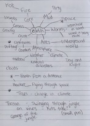

 After writing these down, I can see words that stand out to me as ideas. I think either Earth or Water would be the most interesting/simple elements to base my project on, since the animation we have to make must contain a narrative, I can see the most short stories being made out of these.

So I asked myself, what comes first? ... For me it's writing down all words/thoughts that relate to the elements given to us in the brief: Fire, Water, Earth and Air.
After writing these down, I can see words that stand out to me as ideas. I think either Earth or Water would be the most interesting/simple elements to base my project on, since the animation we have to make must contain a narrative, I can see the most short stories being made out of these.
Saturday, 9 November 2013
Final Piece - Jack in the Box!
After much planning, persistence, and so many test runs, I managed to finish the final piece! Here it is:
The tests I made before this were moving too fast. This is because on Photoshop I completed the wrong settings, which means the timings on the frames were different to 12 frames per second (which is what I filmed it at!) So when I tried to export the video, it would play really fast.
To change this I saw the little frames at the bottom and changed how long they stay on the screen for, from 0 seconds to 0.08 seconds.

Overall I think I've achieved quite a lot in a short space of time; practicing the pendulum technique with the spinning lever, getting different camera angles, and trying to get the speed right with the movement of the boxing glove.
I used key frames in the sequence with the lever:


Using these frames layered on top of each other on a light box, I was able to work out where the in between frames should be placed. After drawing these 4 frames, I drew a circle around the outside to make sure the lever stayed the same length the whole cycle.

 I tried to get the timing so that it would look like it clicked, rather then run smoothly, because I think that would have created a more authentic jack in the box. You can kind of see it, faintly, but the sequence runs too fast to be able to tell.
I used the same frame rate for the scene after, with the high angle of the box, to make it look like the same lever moving. Despite it being shifty - the table not staying in exactly the same place - I think this effect gives the animation a more lively tone to it, rather then just a lever moving:

For the boxing glove sequence, I wish I had created more impact with the glove-on-box, because that would have exaggerated the action further, and maybe made it slightly more comical. However I'm happy with how the glove moves; the speed of it and the little bounce after the impact. If I could go over it again, I would add even more of a recoil to emphasise the overlapping technique:

The concept of the last scene works quite well, as it shows the puppet inside is scared/cautious of what just hit it, so appears for a sneaky peak. I could have made the sequence longer, to show how scared the puppet is, but I think the movement of the eyes works well:


Overall, I'm proud of what I've made in the short amount of time I had to make it! If I could go back on it, I would add sound, just to bring the piece alive! However, I might do once I learn how...
But anyway, back to the present! I practiced some of the techniques and processes I've learnt through the whole project on this task, and I think I pulled them off quite well! I hope you think the same...
Flipbook - Petr Jindra
This is a good example of flipbook animation, as it's allowing the drawings to interact with the person flipping the book.
flipbook from Petr Jindra on Vimeo.
Jindra created a nice, smooth action, getting the timing right with the frog! The character design makes the frog more entertaining to watch, as some of its features have a hint of secondary action - the squash of the eye after it lands, for example - which makes it look smoother but realistic at the same time.
Jack in the Box Development
My final idea requires several objects; a box, table and boxing gloves.
So I thought the easiest way to decide what these things will look like would be to draw them out. I couldn't decide what a boxing glove looked like, so drew out several interpretations:
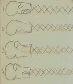

So I thought the easiest way to decide what these things will look like would be to draw them out. I couldn't decide what a boxing glove looked like, so drew out several interpretations:
I think the 3rd design looks the best (second from bottom), as it's simple with a cartoony style. I chose this over the others because I prefer the thumb positioned this way, and the simple stitches in the wrist part look better with this design then the crosses.
I then had to think about what other aspects of the film will look like, and what tool I will draw with (not meaning to sound like a builder!)
Looking in the top left corner of the picture below I used several different media to see which would look best for my animation... And I went with the biro! Because it has the most constant black line, although very similar to the fine liner, I thought the biro would straighten up the edges to my lines.
Going over my other drawings on this page with the biro makes me think I've made the right choice, because it makes the image clear. So I drew different angles of the box, including how it will look damaged, to discover what the lever will look like and figure out in my mind how it will move...
Using the boxing glove designs I created earlier I illustrated my final choice onto this design sheet, and I think it suits well with the style of the other drawings.
I also need different angles of the table I will have in the background, hopefully to set the right scene. The change in camera angles should keep my film more interesting, and build up a bit of suspense as the lever winds up!
Now that I've decided what it will look like, I'm ready to make the actual film!
Monday, 4 November 2013
Jack in the Box Final Idea...
So I followed what I previously wrote as a final idea, and came up with this:

The music lasts for approximately 9 seconds before the puppet pops up... My animation is supposed to be between 5-10 seconds so I will have to shorten the music sequence for mine.
I also looked up the movement of a boxing glove on a spring:
The spring is slow to start with, then it pops and moves faster. So this means for my animation as it hits the box I will have to make fewer frames to give the impression that it's moving faster, and bounces softer and softer as a secondary action (aftermath of the impact between box and glove).
I decided to draw in the last scene because it will show me what it should look like if I do decide to draw it in. This being said, I will draw the other scenes first and see how the film looks, and how much time I have left before presenting it to my fellow animators!
The positioning of the box in scene 4 allows the viewers to see the boxing glove appear more clearly, and having the shots the same in scene 4 and 5 makes the impact of the glove-on-box more apparent, having more of an effect on audiences.
I think the idea would look better drawn out over a light box onto layout paper, because hopefully this will give it a flickery, old fashioned effect.
The most accurate way to get the action right is to use a reference... So I found this on youtube:
The music lasts for approximately 9 seconds before the puppet pops up... My animation is supposed to be between 5-10 seconds so I will have to shorten the music sequence for mine.
I also looked up the movement of a boxing glove on a spring:
The spring is slow to start with, then it pops and moves faster. So this means for my animation as it hits the box I will have to make fewer frames to give the impression that it's moving faster, and bounces softer and softer as a secondary action (aftermath of the impact between box and glove).
Thursday, 31 October 2013
Matrix Style Flipbook Animation
This is an example I found of a flip book animation:
Whoever made this has very good drawing skills! Their use of slow motion and camera angles in a series of drawings is really realistic.
To make the action smoother and slower, they used more frames per second... 120 to be precise!
I like how you can see the slow motion action of the bullet being fired, and the balloon popping, because they're some things that people never get to see, so this flip book has elements to draw in the audience and keep them watching.
Animation Ideas...
Our class were given the task to use all the skills and techniques we've learnt so far - ideas generation, storyboarding, researching, and some of the basic animation processes - and use this to create a 5-10 second animation of our own!
I have to base it on one of these words: Surprise, Lateness, Love, Hate, Longing, Happiness, or Fear.
So first things first; Formulating Ideas.
I started with a mind map of all the words given to us in our brief:

I decided at least one idea for each word would suffice, because I didn't want to overwhelm or pressure myself with too many ideas...
But after considering all the ideas I've written, I decided to use the element of surprise, with my Jack in the Box idea, which goes something like this:
 I haven't decided if to use the last paragraph (hence the question mark!) Because I'm not sure if It's relevant or not, due to the fact we've already had the surprise with the boxing glove, so I could just leave it at that instead of viewing the aftermath.
I thought this idea would be simple, yet still effective and hopefully entertaining, because if I can get the appropriate music and sound effects then that will bring the whole thing alive and build up suspense!
I will animate it with a mixture of frame by frame and pose to pose animation, using either a light box or Photoshop, because I think for this idea either of these techniques will be the easiest to review what I've drawn previously, so I can get the movements right.
It also allows me to practice my drawing!
Using Photoshop would allow me to colour in my frames as well as draw them, and the light box is easier to see what I have drawn previously, and to map out key frames to work from.
I will draft up a final storyboard for my idea, and work out the best camera angles and which technique to use to portray it best.
I have to base it on one of these words: Surprise, Lateness, Love, Hate, Longing, Happiness, or Fear.
So first things first; Formulating Ideas.
I started with a mind map of all the words given to us in our brief:
I decided at least one idea for each word would suffice, because I didn't want to overwhelm or pressure myself with too many ideas...
But after considering all the ideas I've written, I decided to use the element of surprise, with my Jack in the Box idea, which goes something like this:
I thought this idea would be simple, yet still effective and hopefully entertaining, because if I can get the appropriate music and sound effects then that will bring the whole thing alive and build up suspense!
I will animate it with a mixture of frame by frame and pose to pose animation, using either a light box or Photoshop, because I think for this idea either of these techniques will be the easiest to review what I've drawn previously, so I can get the movements right.
It also allows me to practice my drawing!
Using Photoshop would allow me to colour in my frames as well as draw them, and the light box is easier to see what I have drawn previously, and to map out key frames to work from.
I will draft up a final storyboard for my idea, and work out the best camera angles and which technique to use to portray it best.
Monday, 28 October 2013
The Marker Maker - Jonny Lawrence
This has a good combination of 2D frame by frame drawn animation, and pixilation of the hand interacting with the drawings.
It flows nicely and suits the music well, with some subtle humour too.
It was all done on a whiteboard... I couldn't believe this when I first read it! But I think he used an overhead camera to take pictures each time, and had it up on a screen next to him so that he could see what he drew last time, and where to place the next drawings...
This technique has worked really well for Jonny Lawrence, so I will see what other work he has, and hopefully get to try using this technique myself one day!
My Pixilation!
I finally filmed my pixilation! The first thing I had to do was set up the stage where my film is going to take place... So I gathered all my objects and lined them up like so:

I tried to apply all my ideas to the final piece, however I decided to remove some objects from the final line up, because I thought those objects were too big and that my animation might get too long and repetitive!
In my storyboard I tried to use creative and original ways to make the plasticine eat the objects.. I don't want it to be boring so using different camera angles will hopefully help make it visually pleasing for you, the lovely audience!
This is the final piece I produced! I hope you like it:
Overall I am quite pleased with what I've made, however there are a few improvements I would make if I had the chance to do it again:
- I'd hold some shots for longer, such as the close up of the Lego ninja's face, and when the ball lands in front of the shoe on the floor. Just to allow for pauses so the audience can process everything!
- I'd think more about the lighting, because it gets a lot brighter as it gets further into the video (because the sun set, so it was too dark otherwise!)
- More involvement with the hand/person would have made it more interesting.
The next thing I want to learn properly is how to add sound effects to an animation! I think little sounds would really bring my work alive.
Dreaming Girl - Target Advert
This is a really nice use of the pixilation technique:
I like the use of materials (clothes) to express the characters feelings as they play out in this advert. I like this technique generally because it gives the models a puppetry feel, and is good for giving the impression that someone is dreaming...
I like the use of materials (clothes) to express the characters feelings as they play out in this advert. I like this technique generally because it gives the models a puppetry feel, and is good for giving the impression that someone is dreaming...
Photography... Part 2!
Friday 25th October we had another photography induction!


Firstly, after setting up the camera and equipment the same as the first session, we briefly mentioned the rule of thirds, and how if you follow the rule then your work is more visually pleasing to the human eye... I decided to experiment and found this to be true, if you compare the photo on the left to the right... The one on the right looks better! At least in my opinion...
Once we started getting used to the buttons again, Sam, the technician who kindly gave us these tutorials, told us how to change the White Balance on the camera so the lighting comes out right... First we had to take a picture of this grey card in front of the background we intended to use:

Then you go to the menu, and select the white balance, then take another photo of the same grey card, and it comes out like this:

After this, we moved on to trying a slower shutter speed!


We had one member of our group at a time walk around in front of the white background, whilst Sam used the flash every so often, so when the cameras were taking a photo the flash brightened it up and highlighted different positions they were in... See my results above!
I think the one underneath in particular worked well, as I managed to capture full forms of Anna, making her look like a ghost!
These inductions have been very useful, as they gave me the chance to get to know my own camera, and how the lighting can affect a photo.
My Pixilation, Development of my Ideas
This is my attempt at a pixilation... I've not used this technique for over a year so I was looking forward to trying it again!
First things first, brainstorm an idea.
On our brief, it said we were allowed to explore one relationship out of these:


First things first, brainstorm an idea.
On our brief, it said we were allowed to explore one relationship out of these:
- Predator - Prey
- Host - Parasite
- Parent - Child
To start off the mind map seemed to be the best way to jot down my initial thoughts...
After this I could see my ideas more clearly, and decide which would be the most fun and interesting to film/watch!
So I looked over this page, again and again, and decided the time was right to create a storyboard:
I only made this initially in the classroom, to get my ideas down. However the proper ideas developed whilst in my bedroom, as that's where I decided this story should take place. So I used this storyboard as a basis, set up my camera and just went with the flow of things! I kept the concept just about the same, except I added more items into the story...
So now that's all done, I feel ready to make the actual film!
Her Morning Elegance - Oren Lavie
This pixilation has a good use of ordinary objects, such as when they use socks as fish or pillows as clouds; giving the viewers a sense that the main character is dreaming, and remaining in the bedroom at the same time.
The video flows well with the music, using aspects of that in the animation; such as when the violin plays there's a violin floating through this dreamy world of hers, which links the two in together well.
The video flows well with the music, using aspects of that in the animation; such as when the violin plays there's a violin floating through this dreamy world of hers, which links the two in together well.
It has a good rhythm which is easy to follow, like when they're walking, it's always at the same speed.
Neighbours - Norman McLaren
Norman McLaren is regarded as the best when it comes to pixilation animation. This being a good example of what he can do:
This pixilation was a revolution during it's time (1950s). It was the first of its kind in the form of an animation style; combining the music/sound effects with the way the characters move make this film entertaining, even when it shouldn't be.
It was made during the time of the war, so his aim was to communicate the idea of the war with a sense of humour.
"Serious ideas can often be communicated very powerfully with humour" Terry Gilliam
Monday, 21 October 2013
Pendulum - Pose to Pose Animation...
Today, We got given the task of drawing out a pendulum swinging on a lightbox, using key moments in the process, to map out how to successfully pull off the swing. This is developing from the Photoshop induction we had to draw out the pendulum digitally.
This is the resulting animation I made in response to this task:
These are the key frames I drew out first, to get an idea of where the ball will swing:


I think I managed to get a good arc, with a smooth swing that is mirrored on either side of the key frame;
To improve the animation, I would increase the space between each frame as it swings in the middle, to give it the impression it's moving faster. I would also draw the whole thing more central in the page, rather then near the top, so that we don't miss any action!
I'm glad we got the chance to complete this task both digitally and by hand, as I got to see which technique I like best.
This is the resulting animation I made in response to this task:
These are the key frames I drew out first, to get an idea of where the ball will swing:
I think I managed to get a good arc, with a smooth swing that is mirrored on either side of the key frame;
To improve the animation, I would increase the space between each frame as it swings in the middle, to give it the impression it's moving faster. I would also draw the whole thing more central in the page, rather then near the top, so that we don't miss any action!
I'm glad we got the chance to complete this task both digitally and by hand, as I got to see which technique I like best.
Friday, 18 October 2013
The Adventures of Tintin - James Curran
I stumbled across this while exploring Vimeo!
I think it's an interesting style, as it's all revolving around the same circle, with the simple faces, it's great how he can add so many features and accessories for the different characters all on the same circle running so smoothly! It's this feature that makes this video enjoyable to watch; also featuring aspects of all 24 Tintin books.
The Adventures of Tintin from James Curran on Vimeo.
On the source of this link, he also listed his website and twitter username, all of which should have his work on. I will do some investigating and find out!
Photos Galore!
We received a lesson into how to take pictures with a Canon 1100D SLR camera in a studio environment today (18th October)... Which just so happens to be the same make as my very own camera!
First things first was how to set up the camera;
You have the shutter speed, aperture, and ISO.
The shutter speed is how fast the lens clicks after you press the button to take the photo; the aperture is how much light is let into the lens; and the ISO is ...
The basic rule is:
The higher the aperture, the quicker the shutter speed, depending on the lighting in the room.
So anyway, here are some of the results I took after experimenting with the buttons, following the rule as above:
The easier way to find the right exposure is to look at the graph that appears when you look through the viewfinder; there's an arrow with numbers on, depending if the picture will come out too light or too dark... Just get that arrow to the centre (0) and it should turn out fine!
Subscribe to:
Posts (Atom)