After animating for a few days I've started getting to know the character models better. So far they have proved to be difficult to manoeuvre, since they are quite stiff and crack fairly easily; however I am managing to get some movement out of them, as I experimented with a couple of sequences:
I found that the aubergine is slightly wonky and the arms aren't quite long enough to reach the saxophone, but if I stick his feat to the ground then he should have enough stability to lean forwards and back, which could be a way to animate the saxophone solo later on in the video.
The orange also has one leg longer than the other, but he is more stable on his feet; despite this the only movement we really need from him is strumming the guitar, which at first I thought would prove to hinder us as his hands are a lot bigger then the guitar. However I think the motion we have for him works well and gives the piece a humorous charm.
The lemon doesn't have to move much either, though his legs are higher and even. The arms seem to move together unless I hold one of them still, which could become a nuisance to animate with; the basic movements he makes seem to be a bit slow paced compared to the upbeat song, but the animation still works fairly well considering his role in the music video.
In the end we used the character model that David made as a test for the pepper - since this one is much skinnier and accurate to the original character design compared to the one Grace and I originally made. This model doesn't have an armature, so based on my experience with animating plasticine previously in the module 'Responsive', eventually the plasticine will break; however so far it has been holding up fairly well and has been enjoyable to animate; it is easier to stretch and twist his arms, which is good for when he needs to hit the drums.
I can see that the strawberry will be the hardest one to animate; her armature is quite stiff and Grace had to use two different types of clay to cover her body, which means it won't blend well together so it will be harder to fix the cracks caused by her movement. She is the only character who moves around the stage, which will prove to be a challenge (especially with her legs); however I have managed to manoeuvre her as smoothly as I can, which gives the piece a quirky feel to it.
I look forward to seeing what they look like with faces!
Wednesday 29 April 2015
Saturday 25 April 2015
Change of Plans
Due to finishing off other modules, we have fallen behind schedule. Grace's original schedule stated that we start animating everything in the middle of April, but unfortunately I let other things get in the way of that.
However now that the work that was keeping us busy has been handed in, we can finally start animating on Monday! Grace has worked out that if we aim to take 300 pictures per day for 5 days a week then we can catch up and get the stop motion done in good time.
Hopefully if we keep to this new routine we can leave David enough time to animate over the top of it and put it all together into one piece.
Friday 24 April 2015
Deciding on Roles
To organise ourselves, my collaborative partners and I decided upon roles during the post-production stage of the process; deciding this now allows us all to work together on a plan of action to make sure we finish everything in time for the deadline.
I will be doing the title sequence, which will be text on top of the curtains in the introduction. David will be creating the ending credits; if we have time me and Grace will animate the armature models to be included in these credits to add personality to their characters. Grace will be creating a poster to advertise our animation, which could potentially be translated onto a DVD case. We also found a first year student of our course who volunteered to sing the song; she overheard our conversation about finding someone to record the audio and seems happy to do it for us. This is a big help since we need to get this part done as soon as possible so that we can animate to it.
There are a lot more mini roles that need to be completed for the deadline as well, such as finding extra sound effects, but we will see who has the most time out of the three of us closer to the time to complete these tasks.
Setting up the Stage
Before starting the animation, we had to set up the lighting, camera and files on the computer for Dragonframe to automatically save to. We have been keeping the stage in the specialist blacked out room specifically dedicated to stop motion animation, which Grace has been working on gradually over the past month. Moving the stage was easy because all of the wood is attached together, and it fits in the filming booth quite well; however the lights provided in each booth are attached as one mechanism so we were unable to use all of them to light our set.
However we were able to detach one of them to hang over the top of our stage, since we felt it should be brightly lit up with the impression of special effects being used - just like a real concert. Despite this, even with the lights Grace acquired to line the top and bottom of the stage and the LED combined, the image still wasn't bright enough. In the end we used the generic light that hangs above every station and what is used to light up most rooms in the university. We believe this creates a good atmosphere and creates good shadows as well as makes the characters visible.
We decided using my own Canon DSLR 1100D camera and tripod would be best, since I can bring them to the set in the classroom whenever I'm planning to go in and we can get started quicker rather than going at certain times to book out the equipment every day. My camera usually takes good quality photos and we can export the animation we make into image sequences with the right image size so that David can go over it with the drawn animation.
Now that everything is in place and we have a folder dedicated to this project on the university computer, we can start animating!
The Storyboards (Music Video)
David managed to get the storyboards done for us to start animating with! I think they're very well explained and use a good variety of green screening. A lot of the shots look quite similar, mainly at the same angle and focusing on the singer, but there are ways we can improvise with this. As David has already pointed out, some of the movements seem to be a bit too exaggerated to the point where I don't think the models we have would be able to perform some of these movements - but again he has said that we can change bits slightly if they don't work well as actions for stop motion.
Wednesday 22 April 2015
My Collaborative Practice Pitchboards
These are my collaborative practice pitch boards, made by Cara Lambert with my feedback:
Evaluation
This module ultimately gave me a lot of opportunities to publish my work onto professional websites to win competitions, however due to the time limits on each competition on top of my course deadlines I did not feel confident enough to enter most of my pieces.
Despite this, I still had an enjoyable experience in making most of my work; I tried out different techniques and mediums that I do not get chance to practice otherwise. I wanted each piece to revolve around learning a new task, such as perspectives or colouring, which I managed to experience while completing this module.
The brief analysis and pitching tasks at the start of the year for our individual practice had a lot of potential to be useful in teaching me how to pick an appropriate brief for developing my practice. Though I did learn a few useful tips in how to present myself, I still did not understand exactly what work we had to present, so did not feel confident while in the pitching sessions, especially to people I do not know very well.
Even though I started late in my other competition briefs due to focusing on the pitch boards for the taught sessions, I still managed to map out a rough plan of when I should have completed each task. The area of practice I want to develop further for my career is animating, so a lot of the tasks took me a lot longer than I had anticipated, which means most of them are rough, unfinished pieces of work.
Having to create more than one animation for most of the briefs in order to make them substantial took its toll on the quality of my work, since I could not spend as much time on each piece - however I have produced a lot and there is potential with each animation to take further and include in my showreel, which was my ultimate goal through this module. I would have liked to have the animations finished in time for this deadline and entered into their original competitions, but I have learnt a lot about managing my time and which techniques work better.
The opportunity to collaborate came in the second half of the year; this was a new experience for me, and having the chance to work with my classmate proved to be an enjoyable task. Taking what we had learnt from completing the individual pitch boards, we chose the Propercorn brief and get creative with our final idea; the pitching of our idea a few weeks into the project did not go as well as we had hoped, with suggestions that we should change our idea. This ultimately took its toll on us, since we had six weeks all together to hand in for the deadline and we received this feedback too far into the process, we had to re-develop another idea in less time.
This meant that I did not have time to make a full 30 second animation; this is an ambitious amount of work anyway but even halving that time for the animation sample we ultimately decided to submit was only just manageable.
Doing this collaboration made me realise that it is harder to replicate someone else’s designs than I had originally thought; though the gnome design we had continued with was good and seemed fairly simple, I could not redraw it in more than one position. This limited the final animation slightly, since I had less time to make it anyway it would have been harder to try and move the character more than I did.
Apart from this, we worked well together and easily agreed on how each stage of the process was going; I can rely on her to get her parts of the work done, so it was easier for me to focus on my tasks.
In conclusion, I have learnt a lot about my area of practice by completing this module; even though my time was split between too many tasks, I have enjoyed using most of the techniques I have tried. It has made me realise that I can see potential for a career in any area of animation, which does not narrow down what I want to specialise in, but means I cannot rule out any possibilities which I would have done if I had not tried them in these tasks. The main area of improvement for myself is organising and managing my time better, if I had realised how long each project would take I would have given myself more time on each.
Tuesday 21 April 2015
Qwertee - My Designs So Far
After posting both designs up a week ago, they are still up for voting. So far neither have been doing as well as my first two designs, they have both only been available in the 'New Designs (All)' section compared to the first two being in the 'selected' section of the voting pages.
As dynamic as the painted effect looks, maybe both designs were un original and a bit too messy compared to my inspirations. Saying this, I thought they might do slightly better with votes since they are both inspired by popular film/book series, particularly the Harry Potter logo since that is still celebrated by many today even though it finished years ago.
I think the first two designs did better because they are from a popular TV show and film respectively, and I created them in an original way with a variety of colours, which could have appealed to Qwertee users since the designs are so different from the usually popular ones.
Saying this, my most recent designs are still up for voting for at least another week, so they could do better by then.
 |
| My designs still on the website |
 |
| My designs that are finished voting |
Monday 20 April 2015
Bingomation - The Second Half of the Animation (81)
In order to get this animation to loop, for the second half of the piece I started animating backwards, so that it would be accurate. This technique worked for me since I was more confident with the positioning of the character each time.

Animating the character walking into the frame was also relatively simple; I can get away with them taking only one step and then turning on the spot, which moves fairly quickly anyway so I am happy with this part of the animation.
Seeing both elements together shows me how well it loops; I ended up making the first part faster as the character runs off, since this looks more natural then my previous test. The colours I have used so far make the shoes stand out, I'm not sure if I like what I have used so far, but the colour scheme is quite limited, so the skin colour will be difficult to get accurate, unless I change the colour of the background; despite this the authentic sketchiness and patches of colour could also work as a final piece. Apart from this, the physical animation looks good, I have learnt a lot about how perspective works and will incorporate this into my future works.
 |
| The final piece |
Since I have until the 11th May to complete this, I would like to spend more time establishing the colours and double checking the perspective is right based on feedback when I show my classmates.
Friday 17 April 2015
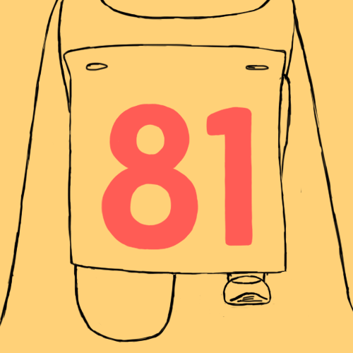
Bingomation - Animating 81
So far, animating my final idea has been a challenge. Getting the person in the right perspective proved to be difficult, particularly the knees.
Firstly I established the position of the character; In order to see the number on the paper attached to the shirt I left it hanging down - this works since it gives the impression that this is a fun runner with a numbered label on their shirt.


Firstly I established the position of the character; In order to see the number on the paper attached to the shirt I left it hanging down - this works since it gives the impression that this is a fun runner with a numbered label on their shirt.
I initially drafted out a rough estimate as to where the knee behind the 81 sign would be, to make it easier to judge the proportion on both legs. I sketched out where the knees are with 3 lines so that the audience have a better understanding of what's happening.
I think the proportions look OK but it moves slightly too slowly for it to be someone starting a race. For these tests I have doubled up the frames, however I will test out a faster speed to see if that works better.
Tuesday 14 April 2015
Qwertee - Mockup of the Hogwarts Logo
After changing my design slightly and retrying it on a T shirt, I was happy with the look. So I duplicated the tee to put on a black and white shirt and tried several different arrangements.
We can add in our own background too, so the logical background to use would be my own design, so that viewers can see it up close. This being said, I found it difficult to decide which composition looked the most interesting; there isn't much difference between these but I wanted each piece to fit nicely in the frame, so you can clearly see the design on the shirt and the logo in the background isn't too overlooked.
I decided on my final composition because you can see both shirts clearly and the logo is centred between the black shirt and the edge of the frame. I would have liked to fit more of the large design in the background on the frame but it was more important to show the tees clearly.
Now it's time to submit my design to the competition, hopefully it'll be up for voting within the next 48 hours!
 |
| My final mockup |
Monday 13 April 2015
Qwertee - Rearranging the Hogwarts Logo
Immediately after adding the details to the design, I put it on the mockup T shirt (as pictured below). I think the colours look good but the paint stops within an invisible square frame; The canvas size I used to create the design is different from the printable area on the T shirt.
To make it look better, I went back to my original design and changed some of the paint splats around the edge so they looked as if they had naturally fallen in the space with a less obvious boarder.
I think the hardest section to rearrange was the green splats; since there were two lines running parallel to the boarder of the canvas this created the illusion of a boarder. I removed the top line, and broke up the second line so it doesn't look as hard; this plus removing/rearranging parts in all the other sections resulted in my final design below.
 |
| Initial mockup T shirt |
 |
| The final design |
Qwertee - Hogwarts Background and Details
Once the main content of my design was in place, it was time to add the details. But before that, I thought I would try using a black background instead of white.
The black makes the colours stand out more boldly, giving the image a dynamic look, compared to the more natural white. I think both of them look good, and I believe both would appeal to different people, depending on if they would prefer a black or a white T shirt, since I know some people who would prefer one over the other.
Since I can put more than one T shirt on my mockup page for submission to their site, I will put both colours on to allow people to have an option if it were to be printed.
The details I applied to the top half of the shield make the piece look more finished; with the two lines connecting the gap in the red and green sections it creates a separation between the shield and colours. Now that I have applied all of the elements to the design, it was time for me to try out the design on a mockup T shirt!
 |
| Finished black lines around shield |
Qwertee - The Hogwarts Logo
Drawing the base of the shield proved to be a difficult start to my design; getting the lines smooth and consistent in size, whilst keeping it symmetrical is a challenge. However using the original design as reference and spending a lot of time on it eventually produced this result:
 I had a similar issue with drawing the 'H' in the centre of the piece, the lines in the original are very calligraphic and I wanted to keep the aesthetic of it, so I copied it as best as I could. I like the white lines running through it, I think they add a shininess to it which brings the piece to life.
 Once I had done this base, I could start adding colour to it; I wanted to add the painted effect to it to create a sense of originality to an iconic design, and I enjoyed experimenting with the brushes on my last design. I wanted to keep each colour in their own corners, but to keep the paint looking more realistic at the same time, so I was only strict with the colouring within the shield. I think the slightly overlapping colours make a nice effect that brings them together to look more authentic.


Once I had put all four colours on, I started to erase the edges of the paint so that they wouldn't cut off at the end of the canvas, hopefully making the design look less square on the T shirt. I think it looks good so far, but adding detail to the shield and tidying up the coloured splats will make it look better.
Qwertee - Harry Potter
After completing my mockingjay design, I was inspired to create more designs in a similar style. One of my favourite series is Harry Potter, which finished a few years ago but is still enjoyed universally by fans to this day.
There are a few different symbols in the series, with infamous quotes and images to go with it. In order to narrow these down I decided to base this on what I want to learn - experimenting with colour and how well they mesh together. This narrowed it down to the Hogwarts logo, because this has 4 clear colours in an intricate design with animals too.
Since I believe this will provide enough of a challenge for me, there are two alternative designs I could take inspiration from:
To start with I will draw my interpretation of the last image with paint splatters in the background and take it from there.
Sunday 12 April 2015
Bingomation - 81
So for my final bingomation idea, I have decided to post it to Bingomation to appear on their tumblr page! I chose 81 because one of the main bingo sayings is "Stop and run", which gives me the opportunity to practice some of the principles of animation, as well as potentially drawing a character.
In order to secure the number, you have to click 'claim a number' on the main page, to be taken to the ask box provided on Tumblr, where you state which number you'd like to animate for:


In order to secure the number, you have to click 'claim a number' on the main page, to be taken to the ask box provided on Tumblr, where you state which number you'd like to animate for:
Now that the number is reserved for me, I can put my idea into practice. With this animation I primarily want to practice drawing perspective - more specifically with a character. This is something that I have needed to improve upon, so I took this chance and will hopefully make a looping animation that's good enough to appear on the Bingomation website!
Saturday 11 April 2015
Qwertee - Mock up of the Mockingjay
Once I finished my design, I could put it onto a T shirt! However once I put it on the mock up kit I realised the paint splatters looked very square; this didn't bother me too much but after some editing I realised the background looked better when it was slightly more shaped around the circle in the centre.
Overall I am happy with the final piece; experimenting with the paint brushes on Photoshop was fun and has taught me more about the software, as well as allowing me to practice improving my line work and shading. I have just submitted the design to Qwertee so hopefully it will be up for voting within 48 hours!
Overall I am happy with the final piece; experimenting with the paint brushes on Photoshop was fun and has taught me more about the software, as well as allowing me to practice improving my line work and shading. I have just submitted the design to Qwertee so hopefully it will be up for voting within 48 hours!
 |
| Original background |
 |
| Final mock up |
 |
| Icon to be displayed on the voting page |
Qwertee - Mockingjay Colours and Brushes
In order to attain the effect of a paint splatter, I decided to download some free brushes available on brusheezy.com; I found the site easy to navigate and the variety of brushes you can get is amazing. I was told about this site through a couple of tutorials I found, explaining how to download brushes and use the splatter tool.
Once I had downloaded the brushes, I decided to make a couple of pages on Photoshop, one of the colours I used and one of some interesting brushes I had found but never used before. Having these pages as reference made the production a lot easier, since I could just grab one of the colours or use the screenshots of brushes to find the texture I wanted.
With my last two designs I had to remember how many colours I had used and try to keep track of everything I was doing, so this technique made everything less complicated so I could focus on developing a decent piece of work.
Despite the cool look the paint texture has, the brush sizes turned out to be very big, going off the edges of my canvas. This turned out to be a slight problem since I had to erase the edges of the splat while still keeping the shape of the splats looking realistic.
 |
| The 6 colours I used |
 |
| Some of the brushes and the new ones I downloaded |
Qwertee - Adding the Details to the Mockingjay
Once I had established the base colour of the bird, I could carry on to apply the rest of the colouring and details to the design:
 Starting with the top left image, I decided the next stage of the process would be to shade in the bird.
I used the same shade of yellow of that in the background, and a tone of orange, blended together with a soft brush, which gives the image a 3D feel to it.
 Like in the original film's image, I wanted to highlight the head and parts of the body, as if they were reflecting the light of a fire in the background. I think this makes the silhouette of the head stand out nicely, especially since it's in the centre of the frame.
Putting a black outline around the bird and circle makes them both stand out compared to the background, despite my use of the same 6 colours; it will also blend in nicely with a dark T shirt, such as black or navy blue.
 After the shading of the bird was done, I figured out a way to sort out the background; I took out one of the yellow paint splats and replaced it with an orange one, except with less of it. In my opinion, this works a lot better then my original background, since the yellow doesn't stand out as much, and the fact I used the same colour as I did with shading the bird, all of the colours on here compliment each other well.
 I decided to try adding detail to the bird to see if it would look better, which I believe it does. Compared to the blotchy background, the detail in the bird looks good and draws the viewer into the image.
Now that all of the elements on this design are done, I can put it onto a mockup T shirt to submit to Qwertee!
I used the same shade of yellow of that in the background, and a tone of orange, blended together with a soft brush, which gives the image a 3D feel to it.
Like in the original film's image, I wanted to highlight the head and parts of the body, as if they were reflecting the light of a fire in the background. I think this makes the silhouette of the head stand out nicely, especially since it's in the centre of the frame.Putting a black outline around the bird and circle makes them both stand out compared to the background, despite my use of the same 6 colours; it will also blend in nicely with a dark T shirt, such as black or navy blue.
I decided to try adding detail to the bird to see if it would look better, which I believe it does. Compared to the blotchy background, the detail in the bird looks good and draws the viewer into the image.Now that all of the elements on this design are done, I can put it onto a mockup T shirt to submit to Qwertee!
Qwertee - Further Development on the Mockingjay
After doing a mockup of this design with the standard paint brushes on Photoshop, I decided I wanted to create something that's different from the original image that inspired me; combining this with other qwertee designs that have appealed to me led me to want to create a painted effect, which I believed would have a bigger effect on my design rather than trying to re create fire.
I had to download paint brushes in order to achieve this effect, but I think it works really well. Despite only having the base colour on at the time, seeing this image got me more excited to carry on experimenting with the brushes and colours to hopefully make better results.


I had to download paint brushes in order to achieve this effect, but I think it works really well. Despite only having the base colour on at the time, seeing this image got me more excited to carry on experimenting with the brushes and colours to hopefully make better results.
I narrowed down the colour of the bird to these 3 images below. I felt that the original colour I went with didn't stand out enough against the new background. After some deliberation I decided the best colour to use was a darker shade of red, because it blends with the background better but stands out at the same time.
 |
| Original colour I used |
 |
| Final colour |
Now that the colours are established it's starting to look a lot better, however I feel that there is too much yellow paint in the background. It looks a bit too messy, which could detract from the bird, especially since I was planning to shade the bird in a couple of shades of orange. I will review the piece and see if there is a better alternative for the background, such as adding in another shade of orange instead of parts of the yellow.
Qwertee - Mockingjay Development
So far I have made a rough version of my idea; I am happy with the shape of the bird and the brush I used to draw it gives the piece a nice tone.


 Originally I used a light shade of yellow for the background; though this makes the silhouette of the bird stand out, it isn't a good colour to use as a base for fire. So instead I used a tone of red, which allowed me to go over it with lighter colours.
Once I had used the orange and yellow colours, the design started to look a lot better, especially when I added detail with a finer line. However I'm still not entirely happy with it - I think the background could look a lot better with a more detailed, painted look, rather than the squiggly lines I have used here.

I will experiment further with the different brushes provided on Photoshop to see what kind of lines can be made, and if any would suit my design better than this.


Once I had used the orange and yellow colours, the design started to look a lot better, especially when I added detail with a finer line. However I'm still not entirely happy with it - I think the background could look a lot better with a more detailed, painted look, rather than the squiggly lines I have used here.
I will experiment further with the different brushes provided on Photoshop to see what kind of lines can be made, and if any would suit my design better than this.
Subscribe to:
Posts (Atom)