Overall this submission has gone well; though we were running out of time towards the end, we managed to finish all of the elements that demonstrate our ideas. The final animation sample looks pretty much how I visualised it, parts of it were hard to animate but the story flows well and the quality of animation is the same throughout. Despite rushing through the animatic, it still shows the timing of each scene through the whole piece, which was the main purpose of making it.
As part of our submission to the Propercorn competition, we had to make a series of boards with all aspects of our work, to show the development and final idea clearly. Cara was the one who put them together, with my opinions and boarder that I made for our initial pitch boards, this is the final result:
I think she has done a good job on these boards; the layout of them all is professional and fit nicely together, and the information on them is clearly displayed with lots of imagery, as was asked of us in the submission details.
Showing posts with label Collaboration. Show all posts
Showing posts with label Collaboration. Show all posts
Friday, 20 March 2015
Thursday, 19 March 2015
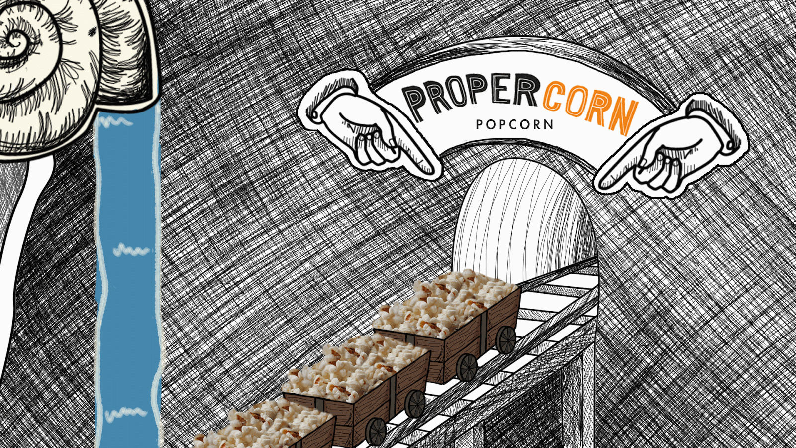
Propercorn - Shot 6
In the final shot, you see the carts driving towards the exit with the newly-salted popcorn. To add more elements to this scene, we agreed that adding in a fountain and flashing lights of some sort would look good.
When animating the water, I used the same technique as in the first shot of only moving the white parts of the waterfall, to give the impression that the water is flowing down when actually the blue colour actually stays the same. For this particular sequence I experimented with the speed of the water; after deciding my first try was too fast, I doubled up the frames to give it a more realistic speed. The final speed works well because it makes the scene feel more relaxed and easy-going, which will be a good impression on the viewers.


When animating the water, I used the same technique as in the first shot of only moving the white parts of the waterfall, to give the impression that the water is flowing down when actually the blue colour actually stays the same. For this particular sequence I experimented with the speed of the water; after deciding my first try was too fast, I doubled up the frames to give it a more realistic speed. The final speed works well because it makes the scene feel more relaxed and easy-going, which will be a good impression on the viewers.
Once I had got the right speed on the water, I tried creating flashing lights above the exit. Using Cara's Photoshop file, I could put the separate layers onto a timeline and have them appear on screen at different times; we debated between glowing light bulbs around the door, like on a dressing room mirror, or lights flashing like a zebra crossing. We both agreed that the zebra crossing lights look better on this piece, since the bulbs would have to be large in order for it to look good, but there wasn't enough space in the frame.
Animating both of these elements was fairly straight forward and enjoyable, it was just a matter of getting the timing right so that the movement isn't too fast to draw attention away from the carts. The scene was set up well, and I think it was a nice way to end the animation sample.
Wednesday, 18 March 2015
Propercorn - Shot 4
Though this scene is the shortest of them all, I still found it a challenge to complete. Drawing hands is one of the most difficult tasks for an artist, particularly getting the proportions right and making it suit the style of the animation.
My first try didn't go too well; this hand looks very out of proportion and I struggled to make it look right whilst animating.
However after trial and error, I finally managed to produce a piece of animation that works.
My first try didn't go too well; this hand looks very out of proportion and I struggled to make it look right whilst animating.
 |
| My own hand as reference |
 |
| The final shot |
 |
| The fully coloured image |
Propercorn - Shots 3 & 5
This was probably the most complicated scene to put together, since it contains 3 elements that I animated separately. I originally made a test for the carts that I animated with After Effects a while ago, but the files that I had animated the carts in were lost as we got closer to the deadline, so Cara animated the final carts in the end.
The final composition consists of 3 elements; the carts, character and sieve. Though the character is a good design and seems fairly simple, I found it difficult to replicate. This was problematic in this scene, since we originally wanted two characters on the podium and for them to move more naturally, but due to the time limit I settled for this performance. If I had practiced drawing it previously then I would have had more experience with him and found it slightly easier to draw, but that was my mistake.
The sieve was fairly simple, since I had just completed the shot previous to this involving the sieve I could use that as reference to get the right shape and speed of the machine.
I used the same Photoshop file to animate the 5th shot, since it uses the same elements except with added salt. This was relatively easy to complete, doing it frame by frame and making sure the dots are big enough to notice, but not too dark was an easy task compared to the rest of the sequence.
Tuesday, 17 March 2015
Propercorn - Shot 2
This shot was relatively simple to construct; it was a matter of drawing the sieve out once then duplicating it to move slightly upwards each time. Firstly I tested out the speed of the sieve; I originally made it too fast, since I imagined it to be a slow moving machine that is fairly old but takes its time to get the job done.
After I established this, I could focus on the background and animating the water flowing out. It was hard at first to get the timing of the water right without it going too fast and looking unnatural, especially with the drips falling out towards the end; however once I got into the flow of it and started timing it better I could get through it quicker.


Monday, 16 March 2015
Propercorn - Shot 1
This was the hardest shot to animate in this sequence; both Cara and I wanted to get a Willy Wonka's factory feel for when the carts enter the flavouring room. I thought the best way to achieve this would be to have a mix of colours swirling around as more water pours out of the shells.
Firstly, I focused on moving the waterfalls. I managed to simplify this task by only moving the white lines that represent the tiny bubbles that appear with water, so by grabbing all three fountains and moving them down slightly for each frame I created the illusion that they are flowing at different speeds; This makes the motion look slightly more natural and interesting.
Next was animating the swirls in the water; I decided splitting each of the 5 sections into their own layers and sorting them out one by one would be the best way to make this work. So by doing it frame by frame and using the onion skins tool on Photoshop, I was able to see what I had done previously and re draw it in the right place. This process took me a while but it was the only technique I could think of to get the best results.
Some parts of the final clip still look rough, especially in GIF form, but I managed to make this scene work at least reasonably well to sell our idea; feedback from Cara suggests she is happy with it so I am too.


Propercorn's Final Storyboard
After a lot of time and development put into it, Cara has finished the storyboards!


They are clear and easy to understand, with the shades of grey giving it a nice tone and making the popcorn packet stand out at the end. The final piece will be coloured, but Cara wanted to create a storyboard that was slightly easier to complete and focus on the shots rather than the colouring.
I think it looks really good, there were a few frames I wasn't sure about but after talking to Cara about them I understand what is happening in each shot. On the pitch boards, we will add a description under each frame (or each board) to explain the story, which will hopefully be easy to understand since we won't see the judges in person.
Now that these are finished, I have a clear reference to look to while I'm animating.
Tuesday, 10 March 2015
Propercorn - Cara's Backgrounds
One of Cara's jobs was to create the backgrounds for me to animate over, so she finished these:
She used that shade of blue as reference to where the water will be, and which parts of the track will be underwater. Overall I'm happy with what she has sent me; the cross-hatched walls, shells and tracks fit with the illustrated look we wanted, and the perspectives generally look good.
This being said, we have agreed that the colour of the water is too dark and dingy to be a creative room, so I will change that before I start animating.
 |
| Shot 1 |
 |
| Shot 2 |
 |
| Shot 2 with reference to where the carts will be (size in comparison to rest of scene) |
 |
| Shot 3 |
This being said, we have agreed that the colour of the water is too dark and dingy to be a creative room, so I will change that before I start animating.
Sunday, 8 March 2015
Propercorn - A Slight Change In Plans
Choosing to only make an animation sample with assisted animatic and why (time management)
Now that we are getting closer to the 19th March (YCN deadline) we realised we have set ourselves a lot of work to do over the next few weeks. The original piece was meant to be a 30 second animation, but after some deliberation about it, we have decided to only complete an animation sample, with an animatic to show the timing of the whole sequence and pitch boards with the design and development work from Cara.
This decision will ultimately be better for the final result, because now I can focus on getting one sequence to a higher standard, rather than spreading my time around 30 seconds of lower quality animation and mis-representing the idea; and Cara can spend more time on the backgrounds needed for our chosen sequence and storyboarding rather than having to create so many backgrounds.
We both agreed the best way to portray our idea was to animate the sequence involving the flavouring room, since this is where the most unusual action happens, and it still has enough content to be a stand alone animation.
The next stage of the process will be for Cara to finish the storyboards and backgrounds, while I experiment with the animation and imagery until all of the elements are there for us to start the final piece.
Saturday, 28 February 2015
Propercorn - Revised Idea
After receiving feedback from our peers and tutor in the pitch, we decided to change our idea. We don't have time to change everything about it, but we can use a similar character design and the idea of carts transporting the popcorn and incorporate that into our new idea, involving a slightly more realistic outlook on how popcorn is made; starting in a corn field, being picked by the gnomes and thrown into the carts as they move on the tracks, to reach a furnace room and a flavouring room after that - we thought the flavouring room could be laid out differently for each flavour Propercorn provides, which gives them potential to take this idea further if they want to.
I like this idea a lot better, we both seem much more confident with this one! Ideally we want this to be a 30 second animation including the popcorn packaging at the end. We will develop on it further and see if we have time to finish everything in time for the YCN competition deadline.
I like this idea a lot better, we both seem much more confident with this one! Ideally we want this to be a 30 second animation including the popcorn packaging at the end. We will develop on it further and see if we have time to finish everything in time for the YCN competition deadline.
Friday, 27 February 2015
Propercorn - The Pitch Boards
We had a session to show off our ideas so far to get feedback from our fellow classmates and tutor. To present the work and research, I created pitch boards, in a similar way to how I pitched my idea individually earlier in the year. I firstly made a boarder to go on each page, to present it nicely and show the viewers which brief we are undertaking.
The first board I put together was summarising all of the research we have undertaken so far, extracting pictures from our Pinterest account to summarise what inspired us in our final idea.
The second board is to display Cara's character design, with variations in colour to gain feedback in what people think of the gnome and which design they think would work best with our idea.
The target audience for the brief is 20-35 year olds, most of the people in my class are in their 20's so it was interesting to see what they think anonymously; There were some different opinions stated about features such as the storyboard (in Cara's sketchbook) but a lot of the comments unanimously stated about out work was that our idea seemed better for a younger audience - someone said that this could be better though since it would widen Propercorn's range. It's an interesting thought, but receiving these comments from our tutor as well has knocked our confidence with this idea; we started discussing alternative ideas straight after the session, which will hopefully be decided upon soon.
 |
| The Boarder |
The first board I put together was summarising all of the research we have undertaken so far, extracting pictures from our Pinterest account to summarise what inspired us in our final idea.
 |
| Pitch Board 1 |
The second board is to display Cara's character design, with variations in colour to gain feedback in what people think of the gnome and which design they think would work best with our idea.
 |
| Pitch Board 2 |
The target audience for the brief is 20-35 year olds, most of the people in my class are in their 20's so it was interesting to see what they think anonymously; There were some different opinions stated about features such as the storyboard (in Cara's sketchbook) but a lot of the comments unanimously stated about out work was that our idea seemed better for a younger audience - someone said that this could be better though since it would widen Propercorn's range. It's an interesting thought, but receiving these comments from our tutor as well has knocked our confidence with this idea; we started discussing alternative ideas straight after the session, which will hopefully be decided upon soon.
Monday, 23 February 2015
A Response from Propercorn
After emailing Becky Akers of Propercorn on the 12th February, I have finally received a reply from her!

Her response is quite vague, though she explained why they kept their brief so vague and open. She states in the email that we should do what we think is best with the brief, which suggests they will be open to a creative response; this makes me glad to have chosen Propercorn because both me and Cara want the chance to be free and creative with our animation.
Despite the brief message, it's still feels good to get a response from them, concluding that they care about their product and their customers, which gives me confidence as we carry on with this brief, knowing that nice people are behind the product.
Friday, 20 February 2015
Propercorn - The Final Idea
After deciding upon the Propercorn brief, Cara and I sat down together and discussed potential ideas that would suit the brief, narrowing them down into a mind map. Our favourite idea involves creating a series of characters and having them working in a mine as the carts with popcorn in drive through - a make believe process of how popcorn is made.


Thursday, 12 February 2015
Propercorn - Contract
In order for our collaboration to go smoothly, as part of the module we have to write up and sign an agreed contract with all the roles we want to take up, to avoid potential arguments later.


Since we know that we both have different areas of interest within the animation process, it was fairly straight forward assigning jobs to each person. I decided I wanted to work with Cara because she is organised and enjoys different tasks compared to myself. I thought we would benefit from each other by combining our strengths to create the best work possible, which makes me excited to get started on this project.
Propercorn
After taking my brief's to the session to show my collaborative partner and comparing the briefs we originally chose, we decided that none of them were sufficient for realising our creative abilities. Instead we reverted back to the briefs we picked for our individual practice earlier in the year to see what interested both of us, and found the Propercorn brief in common.
The brief for it is fairly open, with a wide range target audience and a vague creative challenge, which gives us the creative freedom to do what we wish despite not having an idea of what the judges want to see. This is a challenge both Cara and I are willing to accept though, since the brief has the potential for a fun/creative outcome.
On Propercorn's website, they state that anyone can contact them about anything, whether it would be feedback on the product or making some work for them. Once we read this, both Cara and I agreed that emailing their office with an initial idea would be good, since we can receive feedback from them. I composed this email and sent it to their main contact, Becky:

On Propercorn's website, they state that anyone can contact them about anything, whether it would be feedback on the product or making some work for them. Once we read this, both Cara and I agreed that emailing their office with an initial idea would be good, since we can receive feedback from them. I composed this email and sent it to their main contact, Becky:
Hopefully I will receive a reply from her soon so that me and Cara can take on any advice given.
Tuesday, 10 February 2015
Pinterest for Propercorn
Once we decided to complete the Propercorn brief, we thought it would be a good idea to have a place where we can place and share our research/ideas with each other; Pinterest has been good so far, since you can 'pin' images to one place.
So far it has mostly been Cara finding images relating to the packaging of the brand we are trying to sell, which I believe is a good starting place - to find out what has previously been done, so we can either relate our work to their brand or find inspiration for a new style to use.
So far it has mostly been Cara finding images relating to the packaging of the brand we are trying to sell, which I believe is a good starting place - to find out what has previously been done, so we can either relate our work to their brand or find inspiration for a new style to use.
 |
| Mine and Cara's Pinterest board |
Wednesday, 4 February 2015
Studio Brief 2 - Collaboration
Now that we have analysed a brief and put together pitch boards individually, we have the opportunity to collaborate with anyone from the animation, illustration or graphic design classes.
For this task me and a fellow classmate from my animation class decided we wanted to work together. I have known them for a while now and we have discussed what we would do if we had the chance to collaborate. Since she prefers to generate ideas and designs and I prefer the practical animating side of the process, we thought it wise to join up; especially since this is my first time collaborating on a full project with anyone, I feel comfortable working with someone I trust and I'm confident that we will both put our best efforts into this project.
The first session will involve analysing 3 briefs of your choice, just the same as the individual practice; by the end of the session we should have chosen a brief and written a contract as an agreement of roles within the project, to avoid conflict later. Me and my partner agreed we'd choose different briefs, so we have more to analyse and discuss. Here are the 3 I have chosen:
Vice
[breif here]
This looks to be an interesting brief; with the theme of 'Rule Britannia' I believe there is a lot of potential to either go with a traditionally British themed piece of work or put our own spin on the theme. It is the only brief on D&AD that bluntly mentions you can use animation, which appeals to me as an animator. The brief is very specific with it's target audience and what Vice wants included in the ident, which should make it easier to break down and research appropriately.
WPP
[breif here]
This brief is giving entries the chance to have their work exposed to the world in their new campaign. It wants to have a wide target audience and use technology to inspire and help girls to have an education, which sounds like a very good cause. It will give us the chance to create a variety of products to complete a campaign such as posters, logos and even animation, which could be a good opportunity for both of us to extent our practice and try different things.
Syfy
[breif here]
The main reason I picked this brief over the others from the YCN competition was because it seems to have the most creative freedom in terms of characters and advertising. I wanted to compare the detail into the creative challenge with the briefs from D&AD, which I think will give me a better understanding about what contents a good brief has. I thought it could be a good opportunity to explore character design and animation in a different style then what I'm used to.
I will take these briefs into the lesson tomorrow and discuss these and the briefs my collaborative partner chooses to hopefully come to a decision that will make us both happy.
Subscribe to:
Posts (Atom)