Tuesday, 31 March 2015

Bingomation - 23

An idea I have for Bingomation involves the number 23. Unfortunately this number has already been reserved on their site, but that doesn't stop me wanting to animate it.

Twenty three rhymes with "two cups of tea", so I came up with the simple idea of having the 23 sit on a tray, to be taken out the frame in one direction by one hand, to be replaced with another tray with two cups of tea on it, to then loop back to being replaced by the number 23 again.


This idea is simple, which I think will be fairly easy to accomplish and will look good as well; Once I've designed the tea cups then I can start animating.

Saturday, 28 March 2015

11 Second Club - Lip Syncing

At first, I had imported both characters into one scene to animate all together, however once I had started lip syncing, both of the facial controls were sat over the top of each other. This made things more complicated, since I had to move the right controls and it would be hard to select the right ones. This is when I discovered you can animate one character on one scene, to then import the animated footage into another scene.

So instead of my original plan of setting up the scene first, the very first thing I did was to lip sync both characters in separate scenes.

The facial rig for Moom
Since I am familiar with this character and used the phoneme sheet (with the positions of the face as a character pronounces each letter) as reference, it wasn't too difficult to achieve my final animations.

The first character is the male; he seems to be quite a pretentious guy who is slightly self centred, so I wanted to show this bored expression through his eyes and the way his eyebrows move, especially when answering the phone at the end.


The second character is female; she seems to be very interested in what the man has to say, and when she is interrupted by him she is a bit put out and annoyed about it so I wanted her facial expression to represent this.


After I had completed both facial animations, I combined them into one scene to see if they work:


So far I think I have done well with this animation; the characters are starting to be brought to life through the audio and seeing them both together shows me how well this animation is taking shape.


Friday, 27 March 2015

Modelling

Today Grace and I managed to find time to start making the armature models for our project - we started out with plastic fruits that Grace had acquired as a base for our models, because we're seeing if a hollow centre will make them lighter and easier to manipulate.

I ended up making the armatures for the lemon and strawberry; I found it difficult to puncture holes in the plastic fruits and stick the wires through them, especially the strawberry, but if we apply milliput to the areas around the holes while keeping the arms and legs in the right position then I think this technique could work.


For now though, we just applied the milliput to their hands and feet and left them to set. Seeing them all lined up next to each other is exciting, I can finally see the production starting to come together. Feedback from our other collaborator suggested that we need to change the size of the pepper, to match the original character design; which I agree with, but apart from that the production is running smoothly so far.

All 5 characters

The two characters I made armatures for

The next stage of the process will be to put plasticine over the armatures, I think Grace is planning to do this over the Easter break, since she enjoys the modelling side of it more, so I will be there on hand if she needs me in a few weeks, to hopefully start animating soon!

The Stage

So today I got to see the progress on the stage we'll be animating on:


It's looking good so far! It's a fairly decent size, curves out so it invites the viewers in and has even got lights around the bottom of it already. One of my work partners went to get the wooden pieces cut in one of the workshops of our university, so they all fit well together and it seems to stand in good quality so far. 

The next stage of development will be putting on the curtains, the colourful lights around the top and painting the floor to give the impression of wooden floorboards. This has already been planned by one teammate Grace and should be finished when I'm back from the Easter holidays.

Thursday, 26 March 2015

Time Management...

After some debate, I have decided to focus on animating the music video rather than complete my final idea involving supermarket food.

Taking on a big project like this is a big responsibility, so I would need help to complete it. The assistance I have had with it so far has been useful but no one in my class has enough time to work on my project as well as their own, so I would have to carry on with this on my own. After receiving a schedule from my companion on the music video project, I have realised how much time it will take to complete that video and my own. I want to put my best effort into every project I do, so I believe just focusing on one will be better for my stress levels and quality of work. Stop motion is also something that I have wanted to try again for a while so having the chance to focus on it for a big project will be an amazing opportunity for my showreel and experience.

Despite this, I will still develop on my supermarket idea further, allowing Cara to contribute a refined storyboard if she wishes, as well as more character's from Anna, which I can hopefully test in a few second clips later on. Hopefully I can see my idea portrayed through these tests, to see if it would have worked out and if so I can do more towards it later on when I have more time!

Saturday, 21 March 2015

Grace's Schedule

One of my fellow collaborators on the music video animation Grace sent me a schedule she made for herself from February through to the final crit in May! She has used colours to label each part of the process and when we should roughly be doing things.

The main parts of the schedule I need to focus on are in the end of April and May, since these are the animating sections. 

February

March
April
May

Ideally I think it would be better if we could finish the animation a bit sooner, since on the 8th May we're exhibiting this and some of our other work in a pop up exhibition, but we will see how production goes and have to work around other work for our other deadline at the end of April but we will hopefully be able to start it before the end of the Easter Break.


11 Second Club - Setting Up My Scene

Before I can start animating, I have to create the table and chairs for the characters to sit on. For now, since I only want to focus on animating for this task I will just use blocks as an idea of the setting they are in. I can make the objects using the basic polygon tools, as I have learnt previously in another module, so this didn't take me too long to create. Having both of the characters in the scene to start with was a good reference to what size the furniture should be;


After creating this basic furniture and attempting to start lip syncing my first character, I realised the facial rigs on Maya were overlapping, which proved it would be harder to animate then I had originally anticipated. Instead, I will create a whole project with two scenes within it to lip sync them separately, to then import them into a final scene with the furniture to animate the body movements.

I did a quick test to see if my theory of being able to import animations into different scenes is true, and it turns out it is:


Friday, 20 March 2015

Propercorn - The Final Submission

Overall this submission has gone well; though we were running out of time towards the end, we managed to finish all of the elements that demonstrate our ideas. The final animation sample looks pretty much how I visualised it, parts of it were hard to animate but the story flows well and the quality of animation is the same throughout. Despite rushing through the animatic, it still shows the timing of each scene through the whole piece, which was the main purpose of making it.


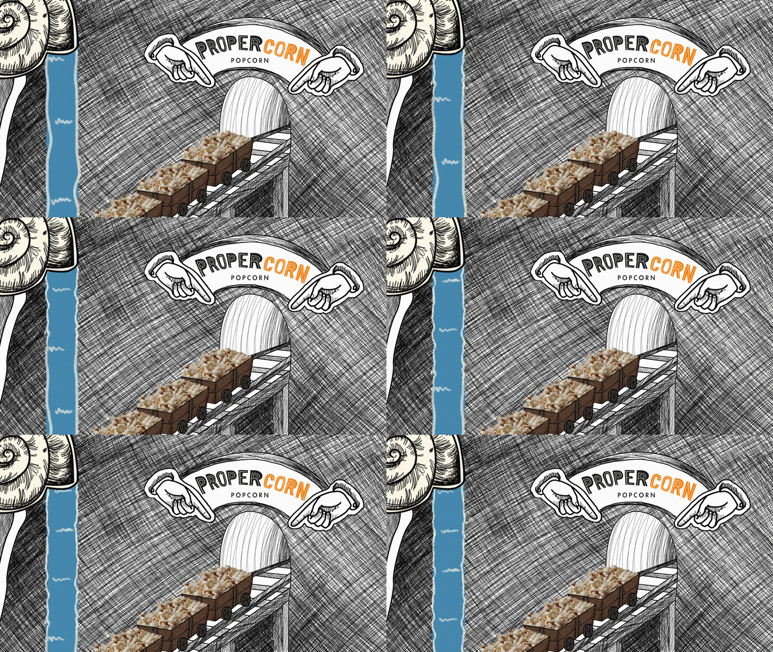
As part of our submission to the Propercorn competition, we had to make a series of boards with all aspects of our work, to show the development and final idea clearly. Cara was the one who put them together, with my opinions and boarder that I made for our initial pitch boards, this is the final result:


I think she has done a good job on these boards; the layout of them all is professional and fit nicely together, and the information on them is clearly displayed with lots of imagery, as was asked of us in the submission details.

Thursday, 19 March 2015

Propercorn - Shot 6

In the final shot, you see the carts driving towards the exit with the newly-salted popcorn. To add more elements to this scene, we agreed that adding in a fountain and flashing lights of some sort would look good.

When animating the water, I used the same technique as in the first shot of only moving the white parts of the waterfall, to give the impression that the water is flowing down when actually the blue colour actually stays the same. For this particular sequence I experimented with the speed of the water; after deciding my first try was too fast, I doubled up the frames to give it a more realistic speed. The final speed works well because it makes the scene feel more relaxed and easy-going, which will be a good impression on the viewers.


Once I had got the right speed on the water, I tried creating flashing lights above the exit. Using Cara's Photoshop file, I could put the separate layers onto a timeline and have them appear on screen at different times; we debated between glowing light bulbs around the door, like on a dressing room mirror, or lights flashing like a zebra crossing. We both agreed that the zebra crossing lights look better on this piece, since the bulbs would have to be large in order for it to look good, but there wasn't enough space in the frame.


Animating both of these elements was fairly straight forward and enjoyable, it was just a matter of getting the timing right so that the movement isn't too fast to draw attention away from the carts. The scene was set up well, and I think it was a nice way to end the animation sample.

Wednesday, 18 March 2015

Propercorn - Shot 4

Though this scene is the shortest of them all, I still found it a challenge to complete. Drawing hands is one of the most difficult tasks for an artist, particularly getting the proportions right and making it suit the style of the animation.

My first try didn't go too well; this hand looks very out of proportion and I struggled to make it look right whilst animating.

My own hand as reference
However after trial and error, I finally managed to produce a piece of animation that works.

The final shot
The fully coloured image


Propercorn - Shots 3 & 5

This was probably the most complicated scene to put together, since it contains 3 elements that I animated separately. I originally made a test for the carts that I animated with After Effects a while ago, but the files that I had animated the carts in were lost as we got closer to the deadline, so Cara animated the final carts in the end.


The final composition consists of 3 elements; the carts, character and sieve. Though the character is a good design and seems fairly simple, I found it difficult to replicate. This was problematic in this scene, since we originally wanted two characters on the podium and for them to move more naturally, but due to the time limit I settled for this performance. If I had practiced drawing it previously then I would have had more experience with him and found it slightly easier to draw, but that was my mistake.
The sieve was fairly simple, since I had just completed the shot previous to this involving the sieve I could use that as reference to get the right shape and speed of the machine.


I used the same Photoshop file to animate the 5th shot, since it uses the same elements except with added salt. This was relatively easy to complete, doing it frame by frame and making sure the dots are big enough to notice, but not too dark was an easy task compared to the rest of the sequence.


Tuesday, 17 March 2015

Propercorn - Shot 2

This shot was relatively simple to construct; it was a matter of drawing the sieve out once then duplicating it to move slightly upwards each time. Firstly I tested out the speed of the sieve; I originally made it too fast, since I imagined it to be a slow moving machine that is fairly old but takes its time to get the job done. 

After I established this, I could focus on the background and animating the water flowing out. It was hard at first to get the timing of the water right without it going too fast and looking unnatural, especially with the drips falling out towards the end; however once I got into the flow of it and started timing it better I could get through it quicker.


Monday, 16 March 2015

Propercorn - Shot 1

This was the hardest shot to animate in this sequence; both Cara and I wanted to get a Willy Wonka's factory feel for when the carts enter the flavouring room. I thought the best way to achieve this would be to have a mix of colours swirling around as more water pours out of the shells. 

Firstly, I focused on moving the waterfalls. I managed to simplify this task by only moving the white lines that represent the tiny bubbles that appear with water, so by grabbing all three fountains and moving them down slightly for each frame I created the illusion that they are flowing at different speeds; This makes the motion look slightly more natural and interesting.

Next was animating the swirls in the water; I decided splitting each of the 5 sections into their own layers and sorting them out one by one would be the best way to make this work. So by doing it frame by frame and using the onion skins tool on Photoshop, I was able to see what I had done previously and re draw it in the right place. This process took me a while but it was the only technique I could think of to get the best results.

Some parts of the final clip still look rough, especially in GIF form, but I managed to make this scene work at least reasonably well to sell our idea; feedback from Cara suggests she is happy with it so I am too.


Propercorn's Final Storyboard

After a lot of time and development put into it, Cara has finished the storyboards!

They are clear and easy to understand, with the shades of grey giving it a nice tone and making the popcorn packet stand out at the end. The final piece will be coloured, but Cara wanted to create a storyboard that was slightly easier to complete and focus on the shots rather than the colouring. 

I think it looks really good, there were a few frames I wasn't sure about but after talking to Cara about them I understand what is happening in each shot. On the pitch boards, we will add a description under each frame (or each board) to explain the story, which will hopefully be easy to understand since we won't see the judges in person.

Now that these are finished, I have a clear reference to look to while I'm animating.

Friday, 13 March 2015

Stop Motion Inspiration

Since I will be collaborating on a stop motion animated documentary, I decided to source some pieces that will inspire me to create a great music video. The first two are from the company Aardman, a deep inspiration of mine that have very stylised characters and manoeuvre clay very well. The third is an animated food documentary; like Creature Comforts, the style of documentary is via interview, but the movement of the inanimate objects is still good. The last video is a music video - shown to us as a class it made us all laugh; I think this is the one that had inspired Grace and David to want to create an entertaining, light-hearted music video to inform the audience, rather than a more obvious form of documentary.

I think working with them on the music video could be a fun experience; with the chance to do stop motion I am looking forward to it!


Wednesday, 11 March 2015

11 Second Club - Final Character Choice

After some deliberation over the available 3D rigs on the 11 Second Club website, I have decided to use 'Moom' for my animation. Since there are two characters audible in the sound clip, I will duplicate Moom to play both characters.

Due to the time limit I have on this piece, I want to use a character that's familiar to me, so that I can focus on getting the lip syncing and body movements right; Using identical characters will test me to see if I can achieve differentiating them through their body language, to give the impression that they're different.

I will place them in a setting as if they are meeting in some kind of coffee shop or restaurant; this will require me to build at least a table and chairs.


Tuesday, 10 March 2015

Propercorn - Cara's Backgrounds

One of Cara's jobs was to create the backgrounds for me to animate over, so she finished these:

Shot 1
Shot 2
Shot 2 with reference to where the carts will be
(size in comparison to rest of scene)
Shot 3

She used that shade of blue as reference to where the water will be, and which parts of the track will be underwater. Overall I'm happy with what she has sent me; the cross-hatched walls, shells and tracks fit with the illustrated look we wanted, and the perspectives generally look good.

This being said, we have agreed that the colour of the water is too dark and dingy to be a creative room, so I will change that before I start animating.

Bingomation - Animating the Dancer

As fun as this part was to animate, I found it difficult to change the proportions to make the animation run smoothly; to solve this I used the end frame as a reference in each drawing to see where my animation should end up. I think it'll be harder to figure out how the dancer will merge into the number 17 once I add colour to it, since they will have to blend together, but I will figure that out when I have more time to complete it and hopefully get it to a good enough standard for my showreel.


I am disappointed that I can not continue this animation right now; I think what I have is good so far, but I set myself too much of a challenge in a short amount of time. It was enjoyable to animate, but if I were to submit it I would need to change the colour of the floor to make it acceptable to bingomation's guidelines. I experimented with this on a single image (below) trying to find a combination that works; I will carry on experimenting and improve the quality of lines so that the character stands out more.

My animation so far
An experiment with colour

Monday, 9 March 2015

Bingomation - 17 Final Character Design - Body


After designing the face of this character, I started to draw her body. Once I had established the basic shape of the shoulders and upper torso, I realised the head I had originally drawn didn't fit onto this body. 


To solve this, I decided to draw another head, but facing straight at the viewer. These two screenshots on the left are a comparison of what I originally had and my final image - I think the second head works a lot better with the angle I drew the body, because you can see the proportions of the character clearly.
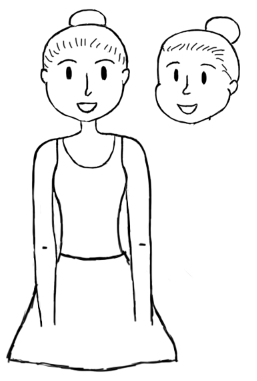


The forward facing face compared to my
initial drawing

Once the top half of her was done, I could start to shape the body; I wanted her to wear a skirt and vest top, so once I had marked out her waist I could easily map out the shape of the skirt to have the essence of a ballerina. 

One problem I encountered was where to place her arms. Originally, as shown in the screenshot to the right, I was going to place her arms over the top of the skirt. I decided against this, since in this particular profile I wanted to show the shape of the skirt/outfit clearly.


Following on from this, I could finish off the design with her legs. 


The easiest way for me to get the right proportions on the legs was to sketch where her legs would be under her skirt, to follow on afterwards with the rest of the figure.

Initially, since she is a ballerina, I wanted to place her in a traditional pose; this generally means standing with your legs together and turning your feet outwards. Part of her design was also to have ribbon tied around the bottom half of her legs, to represent traditional ballet shoes. However after drawing it out, I thought the feet looked odd compared to the rest of the body. 

Instead, I tried erasing the ribbons and just having simple shoes (as pictured bottom left) but it still didn't look right, so I edited the feet, which left me with the final result (bottom right).


Overall, I am happy with this design; it's simple, goes well with the style of my animation and should be fairly easy to replicate.


Bingomation - 17 Final Character Design - Face

The first part of my character I decided to draw was the head/face. This made the rest of the designing process a bit easier, since I had a base to go off.

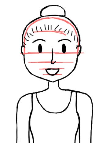
Firstly, I made a rough outline in red, which I drew over in black to mark out where the hair was going to sit; Since she is going to be a ballerina, I thought the most suitable hairstyle for her would be a bun on top of her head, since this is the generic way ballerinas present themselves. Using this as a guideline to pin point where the facial features were going to be.


Once this was done I could apply the stylised features; I think for this particular animation I will make, the simpler the design the better, since this will make manoeuvring her easier, as well as it fitting with the style of the Bingomation format.

So far I am happy with the image, since I think it will fit well with the rest of my animation.