Since I have received all of the footage I need, I could finally figure out the details of my animation.
Overall I think I have made the routines fit together nicely - in my animation I will change the positioning of some of the sequences so that it doesn't seem as if the dancers are on top of each other. For example in Rachel's video, the camera positioning means that she is very low down and small a lot of the time, with her feet cut off sometimes; so for these sections I will make her bigger on the page and position her in correspondence with Kitt.
I recorded several different angles of the male dance, so I decided to incorporate them all into the routine, since different perspectives work nicely in response to her dance moves and will keep the scene more interesting. Using multiple angles will turn my animation into more of a montage of confused thoughts and memories, as opposed to keeping it at one angle all of the time; despite this I only have one recording of my female dancer, but with the focus of the narrative being on the male, this could represent him seeing her at a distance or in his imagination.
I don't have much time to arrange another meeting with Rachel to record more footage, so I have just worked with what I've got.
Wednesday, 23 March 2016
Wednesday, 16 March 2016
Material Tests - Background Development
After receiving feedback on the colour schemes for my background tests from a couple of classmates, they said they like the idea of using blue as my main colour, but to try using a more saturated background so that it doesn't look too dull. I took this on board and tried drawing a rough character layout in the main size I would like to animate this film in, and placed it on different coloured backgrounds (of the same colour scheme) to compare them:


The last test certainly stands out more than the other two; however I still like the tone of the first image, since both colours involved look like different shades of the same colour scale which compliment each other.
I will do at least one animation test on each background to see which compliment the animated movements the best.
Tuesday, 15 March 2016
Glen Keane - Tangled Concept Art
Glen Keane is a famous Disney animator, best known for designing and animating iconic characters such as Tarzan, Aerial, the Beast, and Pocahontas.
One character I particularly adore the development drawings of is for Rapunzel; I own 'the Art of Tangled' artbook, so I can see plenty of drawings from Glen Keane and Jim Kin. The sketchy style used to draw out this character brings the whole image to life, since it's not perfectly realistic but you can still tell who it's supposed to be, which makes it interesting to see scattered throughout the art book for the film (especially next to the further developed drawings and the final 3D look of the film).
Despite the drawings being very sketchy, her limbs all look the right size in correspondence to each other. I think having this rough style (but slightly neater) to animate with could look nice - the small details such as the hands and feet wouldn't have to look realistic, as long as the audience can tell what they're supposed to be.


I believe having this loose style could allow the movements in my animation to become expressive, which will exaggerate the emotions behind them and hopefully give the film a nice image as well.
The next stage of my project will be to test out drawing and animating in a similar style to this, as well as trying other potentially compatible ones, to figure out the final visual style of my film.
Saturday, 12 March 2016
Drawing Practice - Basic Shapes
In order to figure out the style of my characters, I decided the best way to do this would be to draw the body proportions as cylinders and other basic shapes to get the position of the limbs right. This was a good time to get used to the graphite brush that I want to use in my final animation.
It feels light as you move the brush and it leaves a natural-looking texture behind, however if I draw in a sketchy way then it will make some of the lines look thicker, which will look odd and inconsistent. I will have to take this into account when making the final decision on which brush I should use to animate with, depending on the drawing style I go for.
Since I used screenshots from my reference video as a basis to draw these poses, I think they look OK. The proportions on most of them look correct - apart from second from the right on the bottom row with her left leg being in the air. Using these screenshots has helped me start getting used to drawing Rachel in a variety of positions, which is what I need to practice the most; now I need to continue practicing drawing in different styles to figure out the visual style for my animation.

After drawing these poses, I wanted to test how I could draw the dress in motion. Overall I think they have turned out really well - using blue to shade it in really makes it stand out and compliments the red lines quite well. Setting the shaded blue to a lower opacity allows you to see where her legs are, giving the viewer a perspective of the actual shape of her body. It could be an interesting technique to keep these lines in my final animation faded under her dress, so it has a sketchy look to it.

I will use this as a basis for future tests I do and consider how the fabric will be animated.
Friday, 11 March 2016
Drawing Practice - Skeletons
Being able to draw the human body is one of the main reasons why I wanted to challenge myself with this dance animation project. In the past I have found it difficult to get the proportions right to make my drawings believable enough as humans.
In order to get used to drawing onto the computer like I have done with previous projects, I decided to take screenshots from my reference video and focus on drawing those poses, since this is what I will need to draw later on anyway. To start me off, I wanted to try and figure out the basic skeleton of the character and establish where her limbs would be placed.
I drew these skeletons very quickly, so they don't look very neat and the proportions on some of them are slightly off, however giving myself this task to do has helped me to start thinking about how I'm going to draw out my final piece; once I get used to drawing the human body I can figure out my drawing style, to make my animation look well finished and professional.
I tried to capture a variety of poses in key points of the dance routine, however a lot of them show her spinning on one leg, just at different angles.


This has been good practice to develop my drawing skills, so hopefully the longer I draw for the better the results will become.
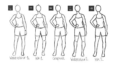
Material Tests - Lines on Background
After deciding I like the graphite brush the most, I decided to compare the texture of this brush onto the backgrounds I have experimented with so far, using the same lines on each background. With the blue colour scheme as a basis for these trials, I wanted to compare how the colours work with each other as textures.
Looking at all 6 of these lined up together is interesting, since I can see how much the colours stand out on each compared to each other. On tests 1, 3 and 6, the darker colour stands out a lot more - the tone of this colour on the background compliment each other quite well, despite them all being different shades of blue. The light colour is completely washed out on all three of them - the glow of the blue particularly contrasts with test 1.
However on tests 3, 4 and 5, the lighter colour stands out more. On 4 and 5, the lighter colour has the illusion that it's glowing slightly, which is a similar effect achieved in Glen Keane's 'Duet'. This would make it easier to keep the background consistent if I end up changing the camera angles or end up having close up shots to the character. If I changed the camera angles on a textured background then I would need to repaint those sequences as the camera moves, so that it looks more natural and give the impression that the whole camera is moving. Once I get all of the reference footage and put it all together then I can decide if I need to change the camera angles or not.
 |
| Test 1 |
 |
| Test 2 |
 |
| Test 3 |
 |
| Test 4 |
 |
| Test 5 |
 |
| Test 6 |
Considering all of these images, I think a solid background will bring out the colour of the lines more; it would also be easier to animate over since the colour is consistent, and there's room to provide my own shading if the animation needs it; similar thoughts could be shared with test 6, except with a dark line being the focus.
I will do animation tests based on tests 4 and 6 to see which moves better, and looks more visually appealing to the audience. I think these two will work best in my final piece because they both have hints of texture, but not too much to make it too complicated or require many changes throughout the film.
Thursday, 10 March 2016
Material Tests - Backgrounds
In continuation of my development of the visual style for my project, I carried on experimenting with brushes in Photoshop, except this time I need to consider which will be most suitable as a background. I want to keep it simple, and ideally not have to change it much throughout the film; so I have provided samples of various Photoshop brushes; this would mean not drawing any features in the background, but rather just keeping it a simple colour that suits the colours and textures of the moving lines.
A lot of the textured brushes on Photoshop have to be applied in at least 3 layers in order to reach the original colour you picked, which has shown various shades of blue and grey in the results below. However having to apply 3 layers could create an interesting way to have a shaded background, provided it doesn't look too strange next to the animated dancers.
I like the texture of tests 1, 3 and 6 here, because they all look painted; if I use one of these textures in my final film I think it would bring the piece to life. I could also use the background as a way to reflect the characters emotions; for example test 1 looks slightly foggy (as if there is bad weather), which could represent the characters lost, overwhelming thoughts as they dance.
Tests 3, 4 and 5 turned out darker than the rest, which is true to the original colour I picked out. After evaluating test 3, I thought it looks slightly too textured, and that it needed another colour underneath it to keep it solid, which is how test 4 was created.
 |
| Brush Samples |
I like the texture of tests 1, 3 and 6 here, because they all look painted; if I use one of these textures in my final film I think it would bring the piece to life. I could also use the background as a way to reflect the characters emotions; for example test 1 looks slightly foggy (as if there is bad weather), which could represent the characters lost, overwhelming thoughts as they dance.
 |
| Test 1 |
 |
| Test 2 |
Tests 3, 4 and 5 turned out darker than the rest, which is true to the original colour I picked out. After evaluating test 3, I thought it looks slightly too textured, and that it needed another colour underneath it to keep it solid, which is how test 4 was created.
I think having the dark undertones in test 4 make it look better, since the colour isn't completely solid, however the darker shades won't take the attention away from the animation. You can see the slight difference in this when comparing it to test 5, since that was just one solid colour.
The brush used for test 6 reminds me of a roller brush when decorating a wall in a house, which has created a natural painted texture here. In order to decide which texture I definitely want to use in the background, I want to test out the textures and colours of the lines against each background to see which is most visually appealing.
 |
| Test 3 |
 |
| Test 4 |
 |
| Test 5 |
 |
| Test 6 |
The brush used for test 6 reminds me of a roller brush when decorating a wall in a house, which has created a natural painted texture here. In order to decide which texture I definitely want to use in the background, I want to test out the textures and colours of the lines against each background to see which is most visually appealing.
A potentially nice effect to have could be using a painted background, and having the moving lines look as if they are etched into the paint. I will experiment further and see if any brushes can create this effect digitally.
Material Tests - Photoshop Brushes, Drawing the Characters
Part of the apeal to do this project was the space to be able to consider the visual style of the piece, to suit the overall concept. Since I now know that my theme is exploring feeling lost, I have been able to properly consider the potential brushes I can use to draw this project with.

Though all have produced similar results, I prefer using the graphite-style brush, since I believe this will produce the textured drawing that I'm looking for.


I like the feel of the graphite brush a lot, it runs smoothly as you draw and leaves an interesting texture on the page - one thing to be aware of is keeping the rough edges of the lines when rubbing out parts, or some parts will become too smooth and unnatural compared to the rest.
Though all have produced similar results, I prefer using the graphite-style brush, since I believe this will produce the textured drawing that I'm looking for.
Wednesday, 9 March 2016
That Ribeiro Company
After receiving 10 responses to my email to the Northern School of Contemporary Dance, I decided continuing with a third year student would be the best option out of all the candidates, since they would have more experience and be more confident in their work then anyone else.
The only third year student to contact me is Sara Ribeiro, a choreographer who has formed a company called 'That Ribeiro Company'. In her email, she specified that she works with 5 male dancers and she's familiar with the 'Thought of You' and 'Duet' animations that I attached to the first email I sent.
This instantly appealed to me, since it struck me that I could have one routine from each gender (since I already have a female dancer) and combine them both to have two characters who feel lost, and eventually find each other at the end, fading in and out of each so that they both get screen time, so that it can cover two perspectives of the story.
In the email I responded to her with, I specified that she could create a minute long routine with one of her male dancers, which I can later merge with the female reference I have, so that the story can involve two characters.
She is on board with this idea and is going to send me some footage of their progress on Tuesday 15th March, so that I can review it and give feedback to improve the routine or incorporate random ideas for my project into, ready for the final recording by the 21st March.
Tuesday, 8 March 2016
Colour Schemes
Now that I have decided the theme of my project will be exploring the feelings of being lost, I can choose appropriate colours to set my animation in.
Feeling lost is generally considered sad, lonely, and sometimes fearful. This means that muted colours would work best to portray the calm yet sad emotions from both characters. It seems the best colour to describe this with is blue, since it's the darkest colour and closest to the gloomy grey and black on the colour pallet.
Using both the monochrome or shades options on Adobe Kuler, I have selected what shades of blue I like the most:


Out of the two, I like the second images colours better, since they are quite gloomy but appealing to look at as well, so hopefully the audience will enjoy watching my film. On the first image there are a couple of shades of grey mixed in as well, so that will give me more options as to how many shades of colours I can use in my animation.
I will start experimenting on Photoshop and Toon Boom with these colours, to see how well they sit and animate together.
Monday, 7 March 2016
The Northern School of Contemporary Dance
After sending out an email about a month ago to the NSCD, the message was finally passed on to the students. So far I've had 6 responses of interest from all year groups, which gives me a lot more choice as to what routine would suit my animation the best.
Since I already have footage from Rachel, who danced solo, I thought it could be a good idea to get at least one more routine from another dancer in response to Rachel's, so that I can explore the concept of feeling lost further.
This would work by having the two separate routines playing through, fading or cutting from one to the other, to suggest two people are lost and are trying to find their way; in the end they will find each other, shown meeting in the centre of the screen.
If I go through with this idea, I could gather as much footage of different routines as possible and choose the best parts of each; then the two characters in my film could be represented by multiple people.
In order to get the students at the Northern School of Contemporary Dance involved, I could propose this idea to them, show them the footage I received from Rachel, and ask them to interpret their part of the routine in their own way.
Since it's late in the process already, I will have to set a deadline in the next couple of weeks for them to work towards so that I can have the full animation prepared and can have enough time to finish the final piece. I can ask them to produce a minute long dance each, since I will need to cut it down to 1 minute anyway, which will give them more time to work on better choreography.
In my statement of intent, I wrote that I would ideally start animating on 7th March; since I have potential contacts from the Northern School of Contemporary Dance and my visual style isn't completely figured out yet, I think it's better that I spend roughly 2 more weeks piecing it all together, with the second reference video and my visual style complete.
From this experience in contacting schools, I realise it takes a while for the administrators to process my email to get to the students; if I had emailed in December or January then I could have allowed them more time to produce a good piece of choreography, which would have been ready for me by now. However I can still work with what I've got - I already have footage from Rachel so even if the other half of the animation isn't quite set up yet, I can at least start the final piece with what I've got within these next two weeks.
Tuesday, 23 February 2016
The Concept of Feeling Lost
After meeting with Rachel and recording her dance routine, we discussed the reasoning behind her movements. She described the motions in her routine as representations of her life so far; it isn't a move-by-move story about her life, but more an interpretation of how she felt at times.
One of the main feelings she had at a pinnacle time in her life was feeling lost, but she eventually found her way, settled in to her environment and found people to talk to about her feelings. This instantly gave me ideas about how I could animate this film, using faded people in the background to show that she's looking for someone.
I could even ask another dancer to create another routine in response to this, to turn it into a story of how two people - lost in the ways of life - can find each other in the end.
Being lost ironically gives me a clear goal to aim for in developing this project; the colour scheme, staging of the characters, and music will all be influenced by this main concept, so now I can get started on creating the visual style for this piece.
Feeling lost is associated with feeling sad and alone, so using gloomy colours such as blue and grey would be appropriate to use, to give the audience a sense of the sadness the character feels. Blue is meant to be a relaxing colour, so it depends if the dance becomes frantic with a lot of sharp movements, or slow and calm as she steadily tries to find her way, as to if using blue is the best option.
Overall I feel good about the direction the project is going, I have a clear sense of the concept, which is a good start into the development of my film.
Monday, 22 February 2016
Reference Video 1
After working on this dance for two weeks, Rachel was ready for me to record the footage today!
Overall I really like the routine; however it turned out to be 3 minutes 45 seconds long so I had to cut it down, especially if I end up incorporating the aerialist dancer too. There are some sections where she is on the floor and the action isn't quite clear from this camera angle, but I will look closely at those parts as I analyse the film further to see if the should stay in the routine or not.
When asked what the reasoning was behind creating the routine in this way, she explained to me that she used emotions from her own life to express how she felt through dance; using this dance as a general symbol rather than specifically miming her life story.
The overview of her emotions in this piece is representing her feeling lost - in some of the movements incorporated into her routine, she looks behind her or into her surroundings as if hoping someone is there. With little details like this I can use animation to project whats going on in her mind; for example when she turns around I could draw another person in the background, either replicating her dance moves or just watching over her.
The music she used in the background when dancing her routine is called 'Hey There Delilah' by the Plain White Ts. It's an acoustic piece, so it's slow, quiet and relaxing. I want to collaborate with a musician to create an original track for my film, however I'm not sure what kind of music would suit my film the best yet. I'll develop the visual style and make sure I have all of the footage I need, and then I can allow the musician the final month of my project to develop the track whilst I'm animating.
In the edited video there are a lot of jumps where I have cut it, which give me the opportunity for either some nice transactions or for it to fade into the second characters routine - I will establish if I want to use another routine before making any final decisions.
See here for the original 3 minute video.
You can view the edited video here.
Sunday, 21 February 2016
Conversing with Rachel
It's been nearly two weeks since I met Rachel Nagy in person, and she's ready for me to record the dance routine she's made!
She sent me a rehearsal that she recorded earlier in the week, so that I can get an idea for how it's going to look... Once I've seen the performance in person, recorded it and looked through it a few times I will be able to establish if it's the dance I want to use for my project.
I told her about wanting to work with an aerialist dancer when we met in person two weeks ago as well - I haven't heard anything from my initial contact since then, but Rachel has given me the contact details for an aerialist in her class who is willing to work with me, so I can potentially combine the two dance routines to make my animation more interesting.
My next step is to go to the studio with Rachel tomorrow morning and record the routine for my reference.
Tuesday, 16 February 2016
Matt Jones' Blog
One of the main inspirations for my work is Matt Jones; I found his blog in my first year of study, but his life drawings are works of art in themselves.
One particular post, 'Drawing with Force', displays some of his life drawing sketches. He doesn't have any descriptions next to them, but it's easy to tell that he is skilled at drawing basic poses. A guest speaker that inspired him to draw these was Mike Mattesi, the same man who created the book 'Force: Dynamic Life Drawing For Animators'.
Some examples of his work are below; using black to sketch them and then going over them in red marker pens really makes the poses stand out - they look rough but accurate, which suggests he drew them quickly. The line of action in each is clearly arced and dynamic, and it's obvious where the weight is shifted on each pose based on the way the character leans. Despite there not being a definite floor to make it obvious as to where the weight is, you can still tell based on the shape of the figure what they are doing.


After looking at his work, it has inspired me to practice drawing using different materials, such as pens, ink, and graphite pencils. A link to his blog is here:
http://mattjonezanimation.blogspot.co.uk/2014/01/drawing-with-force.html
One particular post, 'Drawing with Force', displays some of his life drawing sketches. He doesn't have any descriptions next to them, but it's easy to tell that he is skilled at drawing basic poses. A guest speaker that inspired him to draw these was Mike Mattesi, the same man who created the book 'Force: Dynamic Life Drawing For Animators'.
 |
| A screenshot of Matt Jones' Blog |


After looking at his work, it has inspired me to practice drawing using different materials, such as pens, ink, and graphite pencils. A link to his blog is here:
http://mattjonezanimation.blogspot.co.uk/2014/01/drawing-with-force.html
Monday, 15 February 2016
Adobe Kuler
This doesn't mean that every colour it suggests will definitely work together, but it's a good tool to help me understand what shades to use when colouring my work.
Here's an example of each colour rule available on the website:
 |
| Analogous |
 |
| Monochromatic |
 |
| Triad |
 |
| Complementary |
 |
| Compound |
 |
| Shades |
I think for my project, either the monochromatic or shades options would work best, since using more than one or two base colours could become too complicated. Once the concept of my film is decided, I can then figure out which colour will best portray the emotions of the characters.
Friday, 12 February 2016
'Thought of You' Analysis
One of my main inspirations for this project is Ryan Woodward's 'Thought of You'. The reason it's so inspirational to me is because it's an expressive hand drawn film that uses body language and creative animation to portray the characters emotions. The sketchy, unfinished lines are what bring it to life, because it gives the viewer a taste of how it's made, and Woodward's process of drawing, which keeps the 3 minute film more interesting to watch.
By only using the basic shapes of the human body, rather than creating detailed character designs, allow the viewer to focus on the actions and relate to the story more, instead of focusing on the image. Even though the story is only basic and not very clear, it leaves the film open to interpretation, which engages a wider audience.
Since the female character is ghostly (a figment of his imagination?) this gave Woodward the opportunity to use creative ways to animate her. For example, in the first three screenshots below you can see the process between the female figure and her disapparating into thin air. The animation in this particular sequence is very loose but captivating and animated very smoothly.
In my animation I would like to involve disapparating and reforming of the human figure, as transactions between movements; however this depends on how the dance routine turns out, and if it requires a smooth animation or a rough film to suit the music.


Achieving the line of action in an animation (or any film) is important, since it draws the viewers eyes to certain aspects of the film (this is more down to the staging of the scene) but the smooth arcs created by the dancers graceful movements become more appealing to the eye. In this particular example below, both dancers are momentarily paused in this position, and both have a clear line of action.


Another factor to consider whilst animating is the weight of the characters. Woodward managed to use this creatively by exaggerating the size of the limbs as the male dancer tries to move, making it seem as if they're stuck to the ground; whereas earlier in the sequence the female is hovering in the air for a few seconds, before being caught by the man.
 |
| Heavy weight |
 |
| Light weight |
A lot of aspects in this film are amazing; with the help of the choreographer and dancers, they have pulled together something to be proud of. I will take this as an inspiration towards my film, considering every aspect as in depth as Woodward has (hopefully).
Monday, 8 February 2016
Coffee Meeting
After sending my poster out to the Dance Studio Leeds, my project has gained interest from a student at Leeds Beckett university. She viewed my Linkedin profile, which prompted me to send a message to her to see if she has any interest in my project; it turns out she did, so we decided to meet up in person to talk about the work we could potentially be doing together.
Once in the coffee shop, she told me about a 20 minute piece that she's just about to start making. Her schedule lines up with mine quite nicely; her uni requires her to have 3 minutes of footage ready for the 18th February, which she is happy to let me use. This is earlier than I had expected, so if all goes well I'll have all the reference I need by then, instead of in March.
We discussed what kind of movements I would want to see in the routine, if there should be big motions or little details - since she's allowing me to use part of her 20 minute routine (which she's collaborating on with two other dancers) I'll allow her to develop the concept with the dance partners she works with.
In terms of music, I will consider getting in touch with music students to compose a piece of music to suit the dance, unless Rachel plans to use a specific piece which she'd allow me to use too. I suggested a ballad piece would be better for the animation I want to make.
We have arranged to book a studio space on February 22nd, so that I can see the routine in action and record the reference for myself. From now until then, I'll keep researching and practicing drawing, while she creates the routine and sends me short video updates whenever she can; she's open to suggestions or ideas I might have concerning the routine - for example if I decide to create a background I could see if she can incorporate that into the routine, interacting with objects or props.
It turns out Linkedin is actually a good place to get in touch with specific people; it notifies you when someone views your profile, which is how I found out that Rachel was interested in my project. As well as having a direct messaging system, I could also have published my poster advertising my project, which could have been spread around by anyone who saw it. This would have reached a wider audience, however for now I don't think I need it.
It turns out Linkedin is actually a good place to get in touch with specific people; it notifies you when someone views your profile, which is how I found out that Rachel was interested in my project. As well as having a direct messaging system, I could also have published my poster advertising my project, which could have been spread around by anyone who saw it. This would have reached a wider audience, however for now I don't think I need it.
I'm looking forward to seeing how this collaboration progresses, and seeing if her final routine will be something I want to animate.
Thursday, 4 February 2016
Aerial Dancing Practice...
Since being contacted by an aerialist dancer, the idea of using this technique in my animation is very exciting. After watching some videos on Youtube as examples of aerial dancing, I have noticed a lot of it relies on the poses set by the dancer at each stage of the routine, as well as the set up for it. It looks like it takes a lot of physical strength to perform a dance of this kind, so I really need to show the focus in weight and the strain on the silk as the dancer moves in order for the animation to be believable. Here's an example of aerial dancing:
From this I have taken poses to sketch, as practice incase this idea develops further. With these sketches I wanted to practice gaining the 'line of action' in a characters movements, so in my examples I've marked each with what I think represents the action.
I observed the video above to create these drawings, and I think most of them are fairly accurate; I've noticed that all of the positions look arced and smooth, as opposed to a straight line - even when her leg's bent they aren't completely angled.
With this in mind, I will watch the dancer I end up collaborating with to see how smooth her actions are, and after practicing looking for the line of action, I should be able to draw poses more accurately to keep them interesting throughout my animation.


Subscribe to:
Posts (Atom)